4 Steps to Creating a Beautiful Website
4 Steps to Creating a Beautiful Website
Within five seconds of arriving on your website, can visitors see what your business is doing? Can users easily navigate the blog if they need to? Is the presentation of your rates easy to understand? Do you have an extremely low bounce rate?
If you answer "no" to any these questions, then it might be time to take a close look at the way you have designed and optimized your website.
A website cannot simply be successful by excelling in limited areas (such as design or content). It should be designed to enrich the user experience and functionality of your site, and complement its content appropriately.
Your website should also clearly communicate to your audience what you are doing, why you are doing it and for whom you are doing it.
It’s easy to get caught up in the greatness of your business, forgetting to make sure that we address your audience’s critical concerns first.
So what do you need to know to start improving your website design?
To answer this question, here are 4 tips to make sure you’re going in the right direction when it comes to redesigning your site and not turning visitors away.
4 strategies EWM adopts to improve website design:
1. Create a plan
Don't just design your website. In order for your site to effectively meet the needs of your visitors, you need to plan your buyer's journey from their very first visit to the moment they become a customer.
What pages will they view, what content will they read and what offers will they convert to? Understanding these elements will help you design a site that helps drive leads through the sales funnel.
You want to design your website for the next step, not the final step. It's about answering the right questions in the right order. Maybe this is where the context comes in.
Take what you already know about your current customers (or even interview them) and research how they went from visitor to customer. Then, use this data to define your strategy.
2. Remove the following from your website
Certain elements of your website are going to hurt the value and the message that you are trying to convey.
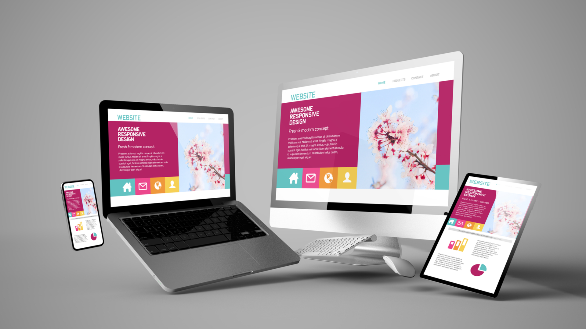
Complicated animations, too long content and too chunky website images are just a few factors.
With an audience that only has an eight-second attention span, you need to create a first impression that gets the main points across easily.
To do this, you should use short, punchy content sections and relevant photographs/images/icons, separated by clear and concise headings.
If you understand correctly, reread the document and make sure it does not contain any ambiguous jargon or terminology. This only serves to scramble your content and confuse your users (which also puts them off).
Words to avoid include:
· New generation
· Flexible
· Robust
· Scalable
· Forward thinking
· Revolutionary
· Best in class
· Essential to the mission
These words have been used excessively by hundreds, even thousands of companies and do not make your content more attractive.
3. Include social share and follow buttons
Producing great content and offers doesn't get any further if you don't give your users the ability to share what you have.
If your website doesn't have social sharing buttons, you may be missing out on a lot of the social media traffic generated by people who are already reading your blog!
If this sounds new to you, social sharing buttons are the little buttons at the top or bottom of blog posts.
They contain the icons of the various social media sites and allow you to share the page directly on the social media channel of your choice.
These buttons act as a non-aggressive tool that encourages social sharing from your buyer persona.
4. Implement calls-to-action
Once your visitors land on your site, do they know what to do next?
They won't know what pages to look at or what actions to take if you don't give them some sort of direction.
Call-to-action buttons are one of the many elements that indicate the next step the user needs to take on a page.
Although many of us know it, it can be easy to not use them correctly to guide users to your website.
It's easy to spam your website with the lowest funnel call-to-action, without even properly feeding your users with other calls to action that either in the middle of the funnel or higher up.
To find out if you are guilty or not, start reading the pages of your website. Do you find most pages, even blog posts, that only have a call to action for a demo/trial/consultation?
If this is the case, it's time to update your site.
Take the time to add calls-to-action that provide them with information to educate themselves and help them solve their problems.
Once they identify your company as the one that provides materials that alleviate these points or concerns, they will feel more comfortable researching your service.
EWM, our leading web development agency in Geneva, offers you its expertise in the creation of highly competitive websites.
Contact our team today to discuss your unique needs.