The Psychology of Colour in Web Design
The Psychology of Colour in Web Design
The process of creating a website is as simple or as complex as you want it to be.
Some websites are just one page in total, featuring the most basic information. Others are incredibly intricate, featuring advanced technology on both the front and back end, as well as a host of other features for an enhanced user experience.
Advances in technology – combined with a deeper awareness of the power of psychology – enable brands to create the most astounding and eye-catching websites that trigger positive emotions in audiences.
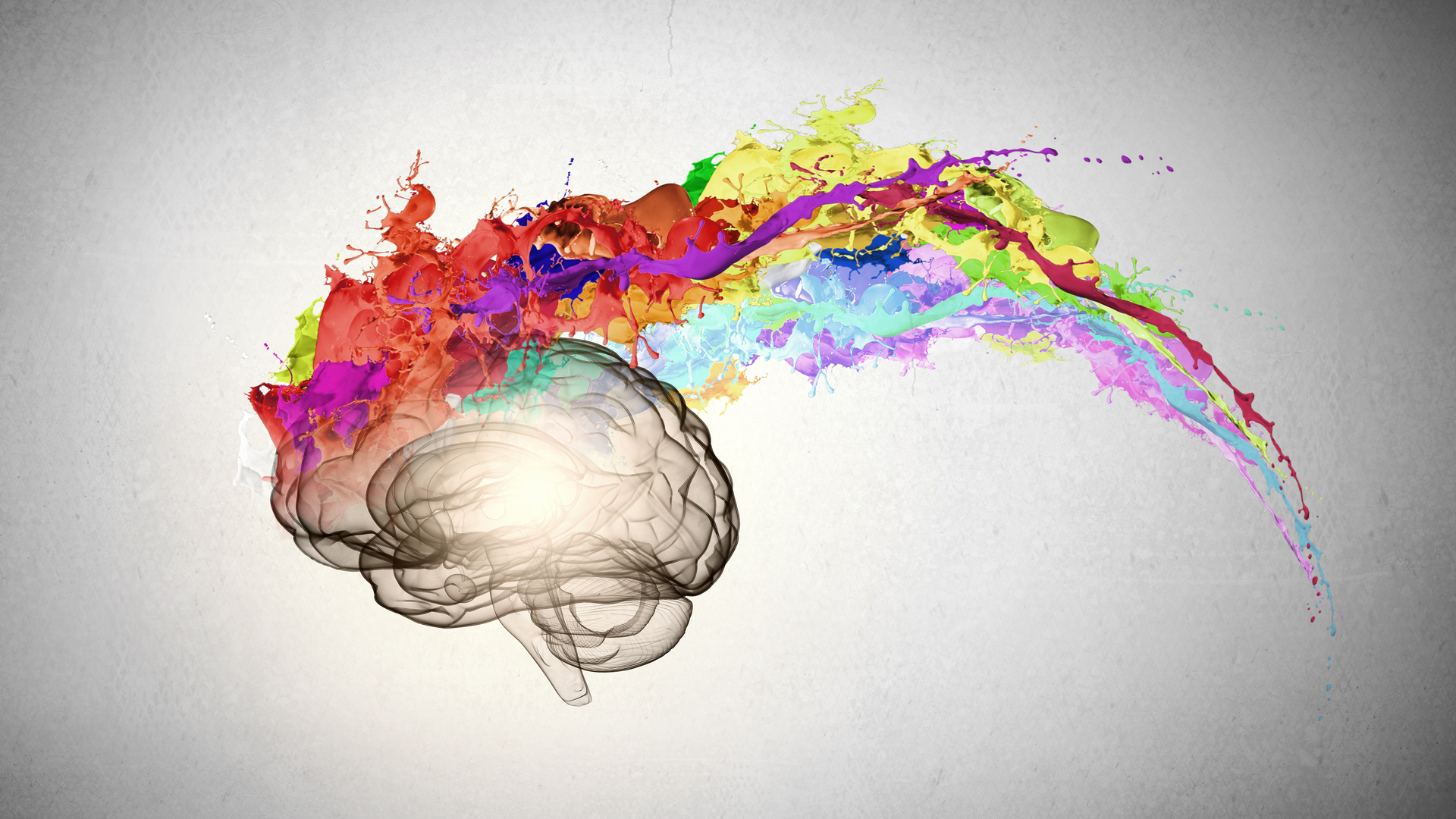
We’ve talked about colour recently on the EWM blog, and that’s because it plays such a significant role in web design, influencing our attitudes and emotions dramatically without us even realising it.
Certain colours communicate certain messages to the brain, triggering moods, emotions and therefore behaviours.
The psychology of colour can help strengthen your brand, encourage sales, and even encourage visitors towards specific pages of your site. For this reason, when selecting colours for your web design, it’s essential that you choose carefully to ensure that your selected colours that will trigger the right response in your audience.
Colour Influence and Web Design
During the web design process, you should carefully select which colours you use across your site. This relates to your general colour scheme as well as colours used in your logo, borders, backgrounds, menu bar, buttons and pop ups.
The colours that you use depend significantly on the type of business you operate. For example, if you are an investment bank then it would be wise to steer clear of bright yellows, as this shade is more suited to a site selling children’s toys, or one focused on something creative.
Certain colour combinations, such as dark green mixed with orange, feel jarring to look at, whereas when you pair dark green with white, it has a calming, more contemporary look to it.
Understanding how colour affects consumer psychology is fundamental, and can significantly influence your design choices. Adopting the ideal colour combination on your website enhances consumer trust while establishing a positive perception of your brand.
Here are some colours and their typical psychological associations:
Red
Associated with speed, energy and passion. This is a great colour to use if you want your audience to take action. Red is often used in e-commerce, advertising, marketing, sports, and entertainment. However, don’t overuse it, and steer clear if you’re in the luxury goods sector or anything nature-related.
Yellow
A warm, positive and inviting colour that’s associated with joy and happiness. This is a superb choice if you’re in the services industry, as it creates a feeling of calm. It’s also a good choice for call-to-action text and buttons. Avoid overusing it, however, as it can feel cheap or spammy, and can even be a strain on the eyes.
Blue
This is a versatile and universally-loved colour that has been shown to evoke feelings of trust, loyalty, dependability and wisdom. This is a firm favourite in numerous website colour schemes, including Facebook, Nintendo, MailChimp and Good Fortune. If you’re in the tech, medical, legal or healthcare sectors, this is a great colour to go for.
Orange
This is an impulsive, fun and optimistic colour that can stimulate physical activity, confidence and competition. If you’re a brand that doesn’t take itself too seriously, this could be the colour for you. it’s particularly good at drawing people’s attention to something particularly important, such as a call-to-action, and can also be used to communicate caution.
Pink
Pink is great for feminine products or sites primarily geared towards women and young girls. Opt for pink if you want to communicate charm, tenderness, approachability and peace. This colour becomes sophisticated when combined with black, grey or darker shades of blue. Bear in mind the tone of pink you opt for: bring pinks can be gaudy, while light pinks can feel too sentimental for some brands.
Green
Ideal for environmental products, outdoor goods, and anything related to nature and health. This is a calming, balancing colour and the perfect choice for a health-conscious brand. It’s also ideal if you’re trying to promote eco-friendliness and sustainability, or are in the tourism and medical sectors.
Black
A colour of luxury, glamour, sophistication and modernity. Its minimalism is a great choice for luxury brands: many cosmetics and luxury goods companies opt for black as their main colour to demonstrate the quality of their products. Don’t overdo it though; too much black can make people feel uncomfortable or even afraid!
Grey
If you want to evoke maturity, formality, professionalism and authority, grey is a great choice. Grey is a more serious colour that shows people you mean business, so if you’re a more professional business or are in the luxury goods industry, go for grey.
If you are in the process of creating a new website or are re-branding your current design, you need to think carefully about the use of colour across your site. Evidently, colour has the power to evoke particular emotions and when used wisely can trigger a specific response in your customers that encourages them to take action.
Do your research carefully before choosing your website’s colour! If in doubt, reach out to EWM for support!