Our Top Web Designs of 2022
Our Top Web Designs of 2022
Although it is a major decision to establish a website presence, the best websites are often the result of small decisions.
Designing your website requires time, effort, and inspiration. We've compiled this list of some of the most beautiful website designs we've seen in 2022.
9 Favourite Web Designs Of 2022
Mubasic
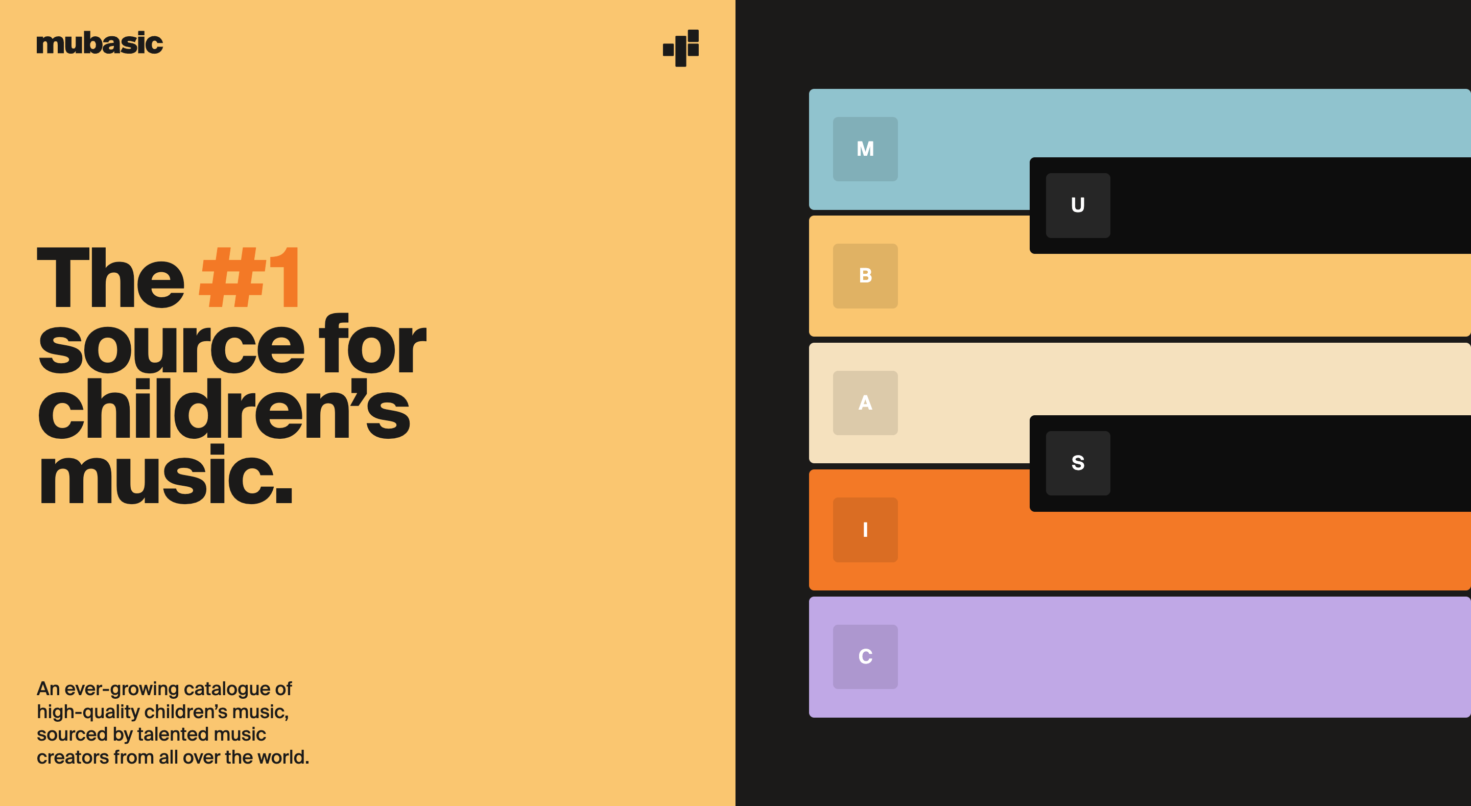
Mubasic website is dynamic and not just visually appealing.
Mubasic is a catalogue of high-quality music that children can enjoy. The website's design choices help to give it a light-hearted, casual feel.
Although the site's design is successful due to its effective visual hierarchy and poppy colour scheme, the real reason it shines is because of how authentic the design feels to the brand's mission.
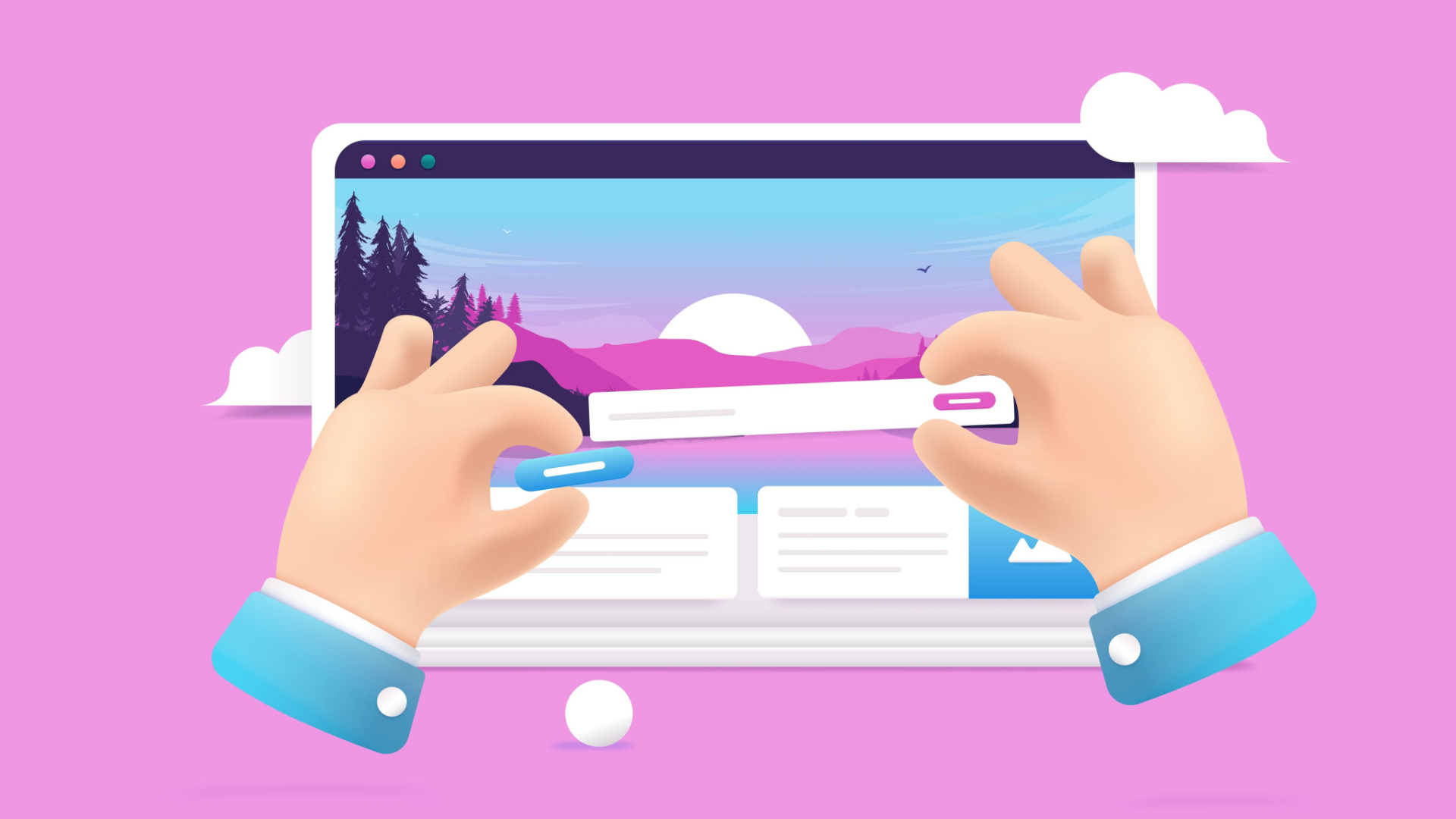
You can easily explore the company's offerings from the homepage. It also features a Q&A section in a unique format. Scroll down to see images, and at the bottom, you'll find contact information and a customer form template.
You'll find a menu with anchors at the bottom of your home page. This allows you to easily locate the information you are looking for.
Digital Cover
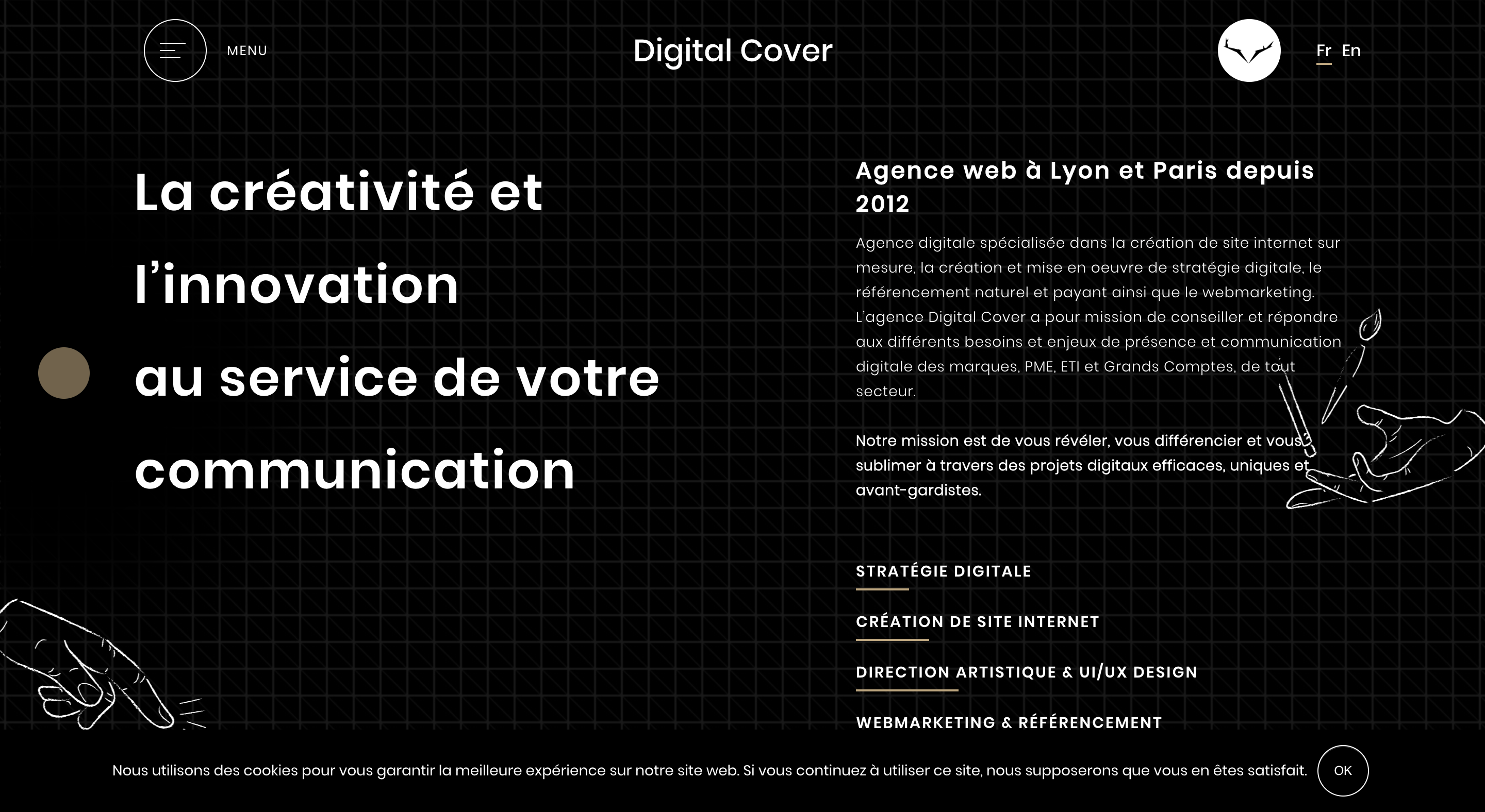
The entire experience is visually stunning, from the loading screen to the homepage of this France-based digital agency's webpage.
You are immediately immersed in Digital Cover. An almost three-dimensional graphic pops up to welcome you into the company's world.
Digital Cover's homepage, similar to the previous site, has an animated nature that adds intrigue. This site is certainly a contender for the best website design.
You can navigate the menu at the top left, or browse the company's projects by scrolling with you mouse.
When you click on a feature, you will then be taken to the page you have selected. The contrast between the black background and white letters makes the copy stand out. Scroll down to the bottom of any menu page to find contact information. This is another strength of this design.
IBM's The Harmonic State
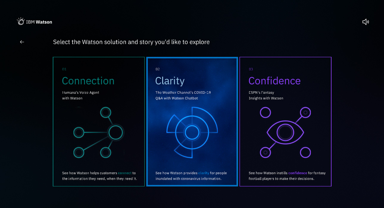
It's easy to see why this IBM website won an award.
It is best to describe the website as an immersive experience. IBM uses visual and audio elements to attract visitors and keep them interested.
To get the best experience, headphones are required. Even if this step is skipped, the interactive background will draw you in as your mouse moves across the page.
The page also has a balanced layout with a large title, which grabs your attention from the small description and a bold blue CTA.
IBM uses visual storytelling to explain the Watson tool's operation in real life, a complex topic like AI. Three stories can be explored using video in a video game like structure. This helps visitors to learn more about the tool.
This is a fun and effective way for users to engage in complex topics that can seem dry and boring.
Superlist
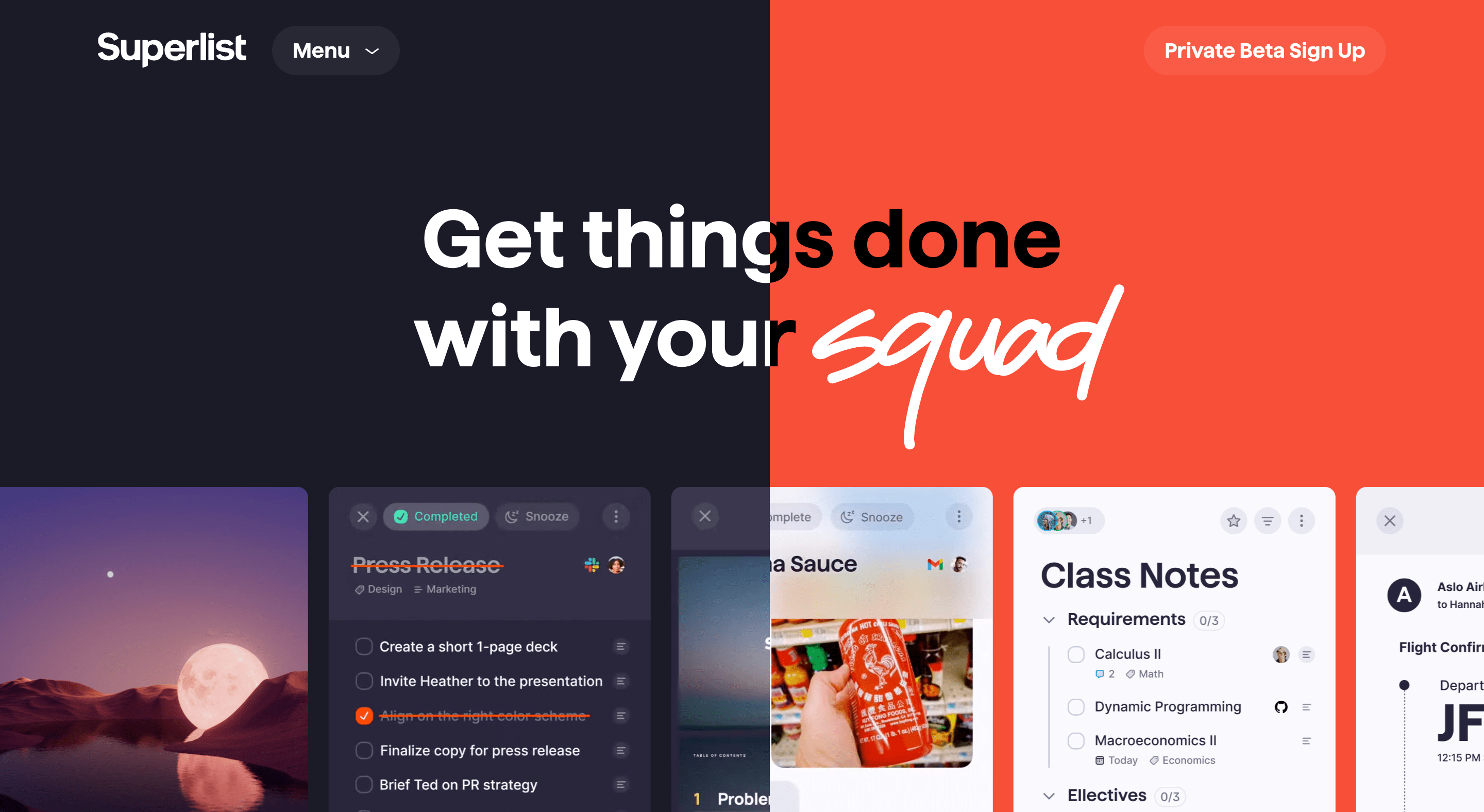
Superlist is an app that improves productivity for individuals and teams.
This interactive homepage displays common accessories, such as headphones and keyboards, with concise copy.
Superlist uses white space effectively to keep the attention on its copy. To make navigation easier, they have a button with an arrow icon that indicates there is more on the page after you scroll.
The fun visuals keep you interested as you learn about the brand.
Swab The World

Parallax bold colours and negative space is what makes Swab the World unique.
This organisation raises awareness about stem cell donation. Their mission is "To ensure every patient finds their match." Photographs of couples showing love and emotion add a human dimension to an otherwise complex scientific process.
Technically, the design makes it so easy and natural to move down the page, ensuring readers reach every point of copy.
Newest Americans
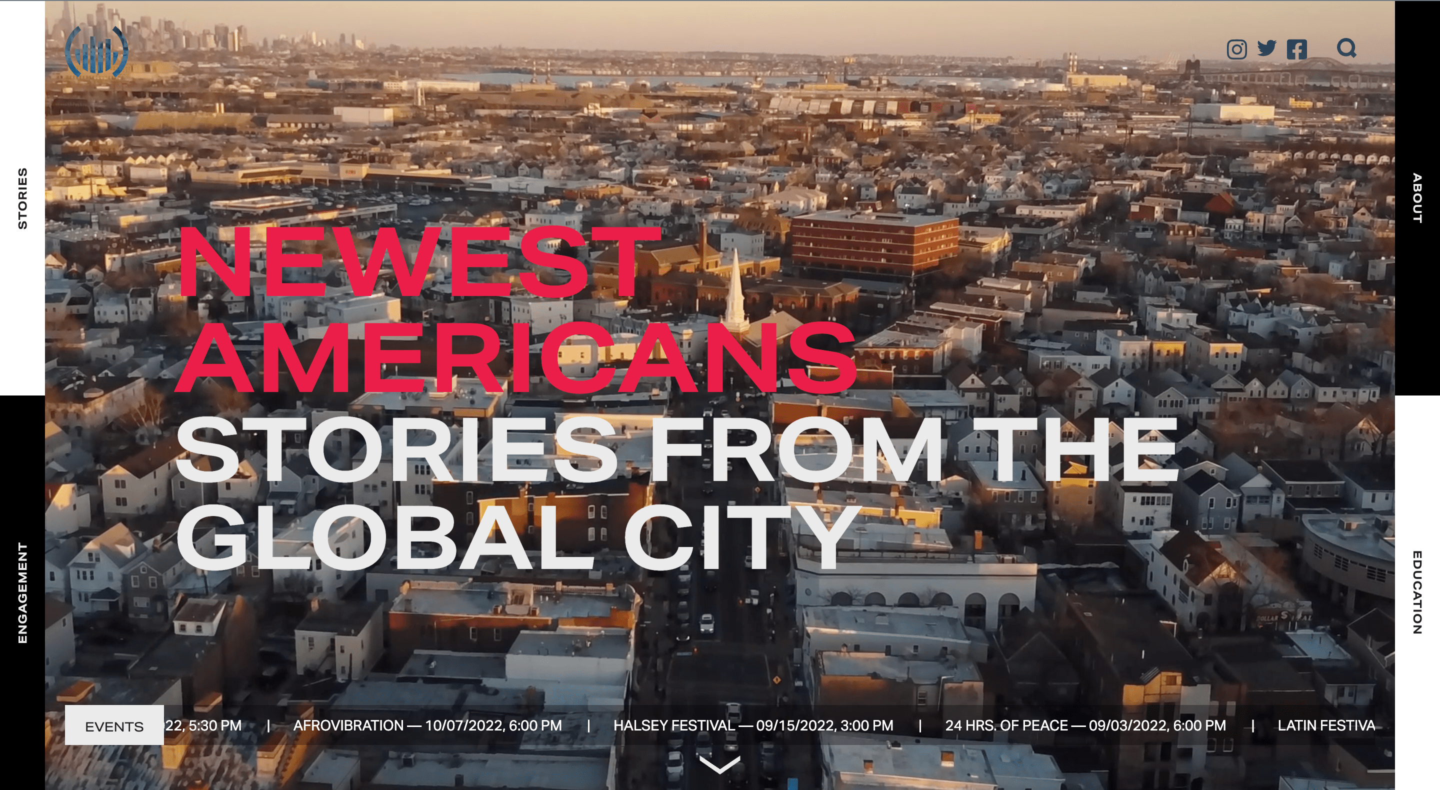
This website features beautiful images of people, places, items, and other elements that reflect this experience. It tells the story of America's newest citizens.
This is a visually attractive website whilst remaining fully functional. It has simple navigation that inspires you to keep scrolling. While copy is of paramount importance, it’s clear that the use of stunning photography is the emphasis of this website.
Spotify Design
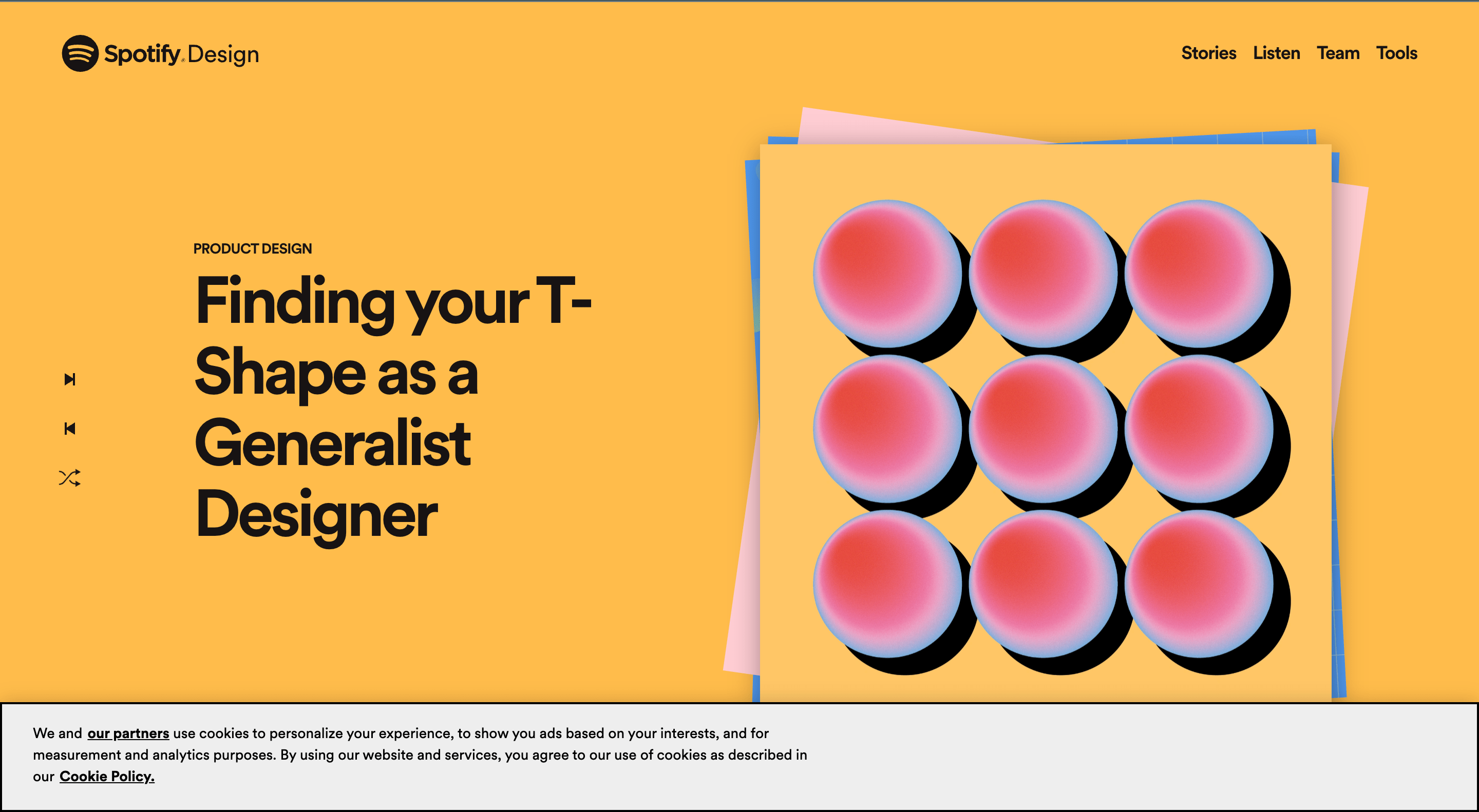
Spotify is well-known for many amazing feats. The latest iteration of Spotify is no exception.
The music and podcast streaming company serves as the central hub for all things visual and creative, and gives listeners an insight into who, what, and why Spotify is so amazing.
This website has depth and character thanks to its bright colours and smooth animations. Albums and artists seem to pop out and are easily accessible thanks to their flat geometric designs and abstract accents.
Andy Warhol
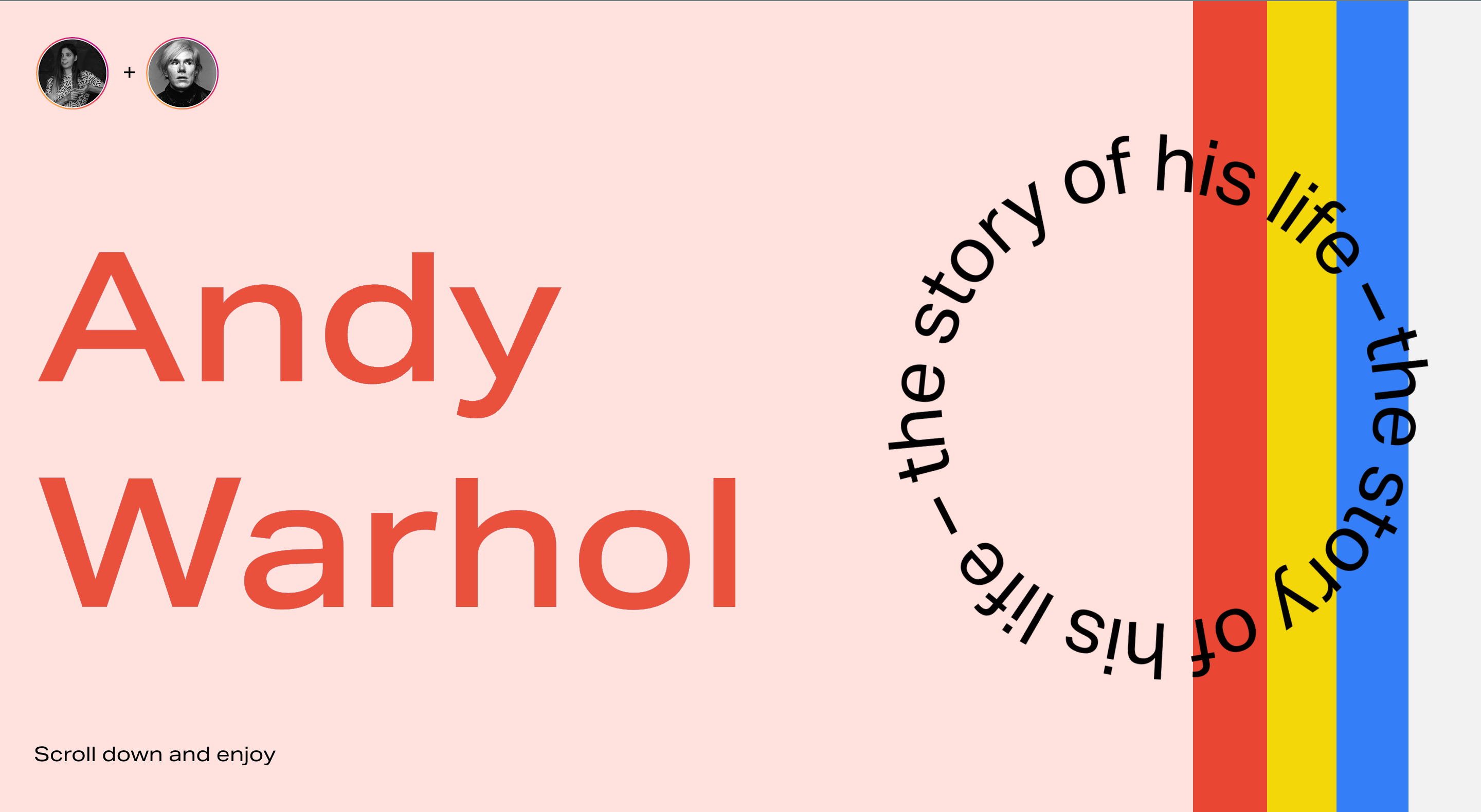
This stunningly designed website captures the life of Andy Warhol, an artist, filmmaker, and producer. Your cursor transforms into a spotlight as you browse the page. It converts any image you hover over to a negative, or reverses the colours in the text.
As you browse the homepage, subtle animations set the tone and pace for each section. This is a bright, fun and interesting web design.
Human Interaction Company
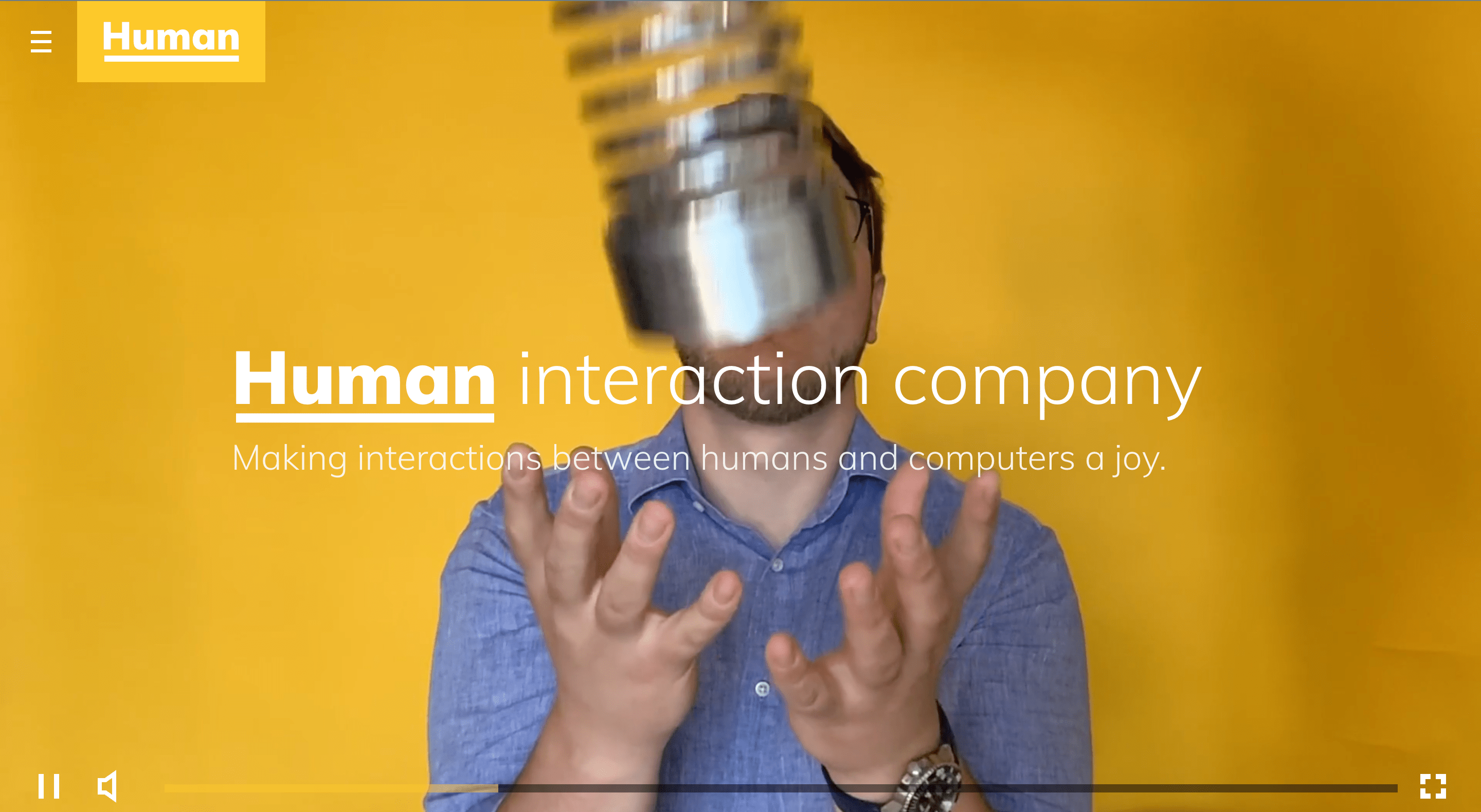
The Human Interaction Company has a fun and happy vibe, from the moment you enter the site. Videos and photos are all original, and reflect the authenticity and dedication of this brand.
Closing thoughts
The designs of 2022 showcased in this article will surely pave the way for a new era of web design and development.
he designers of these sites have taken inspiration from various sources and created unique and innovative designs that stand the test of time. So, if you're searching for something fresh and exciting in the world of web design, take a look at these 9 incredible examples!
Seeking a brand-new web design to take you into the New Year with a bang? Look no further than EWM, our leading Geneva-based web development agency.
Contact us today for a chat!