
UX and ROI: how design boosts conversions
UX and ROI: how design boosts conversions
A website can double its results without more traffic. If I reduce friction, clarify the journey, and show the right trust signals, I can increase conversions, lower acquisition costs, and limit support costs.
In short, the article says three things:
- UX impacts revenue: a better journey can increase conversion rates from 2.0% to 4.0% with constant traffic.
- Losses often come from simple points: slow pages, unclear navigation, lengthy forms, vague CTAs, lack of trust signals.
- ROI is measurable: conversion, revenue per session in CHF, abandonment, support tickets, retention, and churn.
I also note a simple point: for a Swiss audience, it is necessary to display prices in CHF, offer well-managed languages, and show clear signals like local contact details and compliance with the LPD. Otherwise, even a strong offer can lose leads.
Some striking figures:
- 75% of people judge a site based on its design
- 88% do not return after a bad experience
- each additional field in a form can decrease completion by 5 to 10%
- a clearer CTA can increase conversions by 40 to 50%
- after a redesign, some teams also see fewer support requests
My reading is simple: design is not just about looking good. It is about selling, reassuring, and prompting action. The following sections show where the conversion funnel breaks, and which KPIs to follow to link UX to revenue.
Where UX breaks the conversion funnel
Blockages are seen in the funnel, not in instinct.
Conversion frictions appear at specific points in the user journey. Often, the signals are already present in the analytical data before taking the time to look at them.
First impression: slow pages, confusing navigation, and insufficient localization
When a page takes more than 2.5 seconds to load, the [5][3]. It's simple: if everything is slow from the start, the user loses patience. Confusing navigation or vague labels have the same effect. Visitors leave the page because they don't quickly find what they came for [1][6].
For a site targeting the Swiss market, incomplete localization also creates immediate discomfort. No clearly visible local contact details, no prices in CHF, no clear legal notices, no language choices: all of this creates a distance. And this distance undermines credibility from the first few seconds.
When the user finally reaches the right page, the test changes in nature: they must be able to decide without hindrance.
Decision stage: long forms, lack of trust elements, and vague CTAs
It is often at this moment that abandonments suddenly increase. Each field added to a form can decrease the completion rate by 5 to 10% [3]. In other words, a form that is too long can erode conversion field by field.
A case speaks for itself. A B2B SaaS provider reduced its registration form from 10 fields to 3. Result: a 45% increase in the total number of registrations [3].
For Swiss users, trust elements are just as important. If local contact details are missing, if prices are not displayed in CHF, or if the privacy policy remains unclear, doubt sets in quickly. Even a visitor already convinced by the offer may hesitate at the last moment.
And the work does not stop once the form is submitted.
After conversion: poor ergonomics increase costs and accelerate churn
The impact of UX does not stop at the conversion click. A client area that is difficult to navigate or poorly explained onboarding often leads to a series of support tickets. Mozilla directly observed this: after a redesign project focused on interface clarity, the organization received 70% fewer support calls [4].
Correcting frictions after conversion helps reduce support costs and slow down churn.
sbb-itb-454261f
How UX improves conversions measurably
Correcting frictions is a good start. But it's not enough if each change doesn't produce a clear gain in conversion. Ultimately, this is reflected in completion rate, bounce rate, and contact volume.
Simplify key journeys and remove unnecessary steps
The rule can be summed up in one sentence: the less the user has to think, the more they act. Clear information architecture, easy-to-read visual hierarchy, and mobile journeys designed for thumb use reduce mental load and help make decisions faster.
In forms, every field removed can have a significant impact. Going from 11 fields to 4 can increase conversions by 120% [1][2]. And anything not immediately useful can come later, displaying advanced fields at the right moment.
Action buttons also require careful attention. A clearly visible CTA, with a direct wording - "Get my free quote" rather than "Send" - can increase conversions by 40 to 50% [3]. On mobile, the recommended minimum size is 44 × 44 px to keep interactions simple and effortless [3].
When the journey becomes lighter, the final blockage often lies in another area: trust.
Use content and visual signals to build trust
Trust is not proclaimed, it is built, detail by detail. A well-placed reassurance block - client logo, SSL certificate, verified reviews, clear satisfaction guarantee - can reduce hesitation just before taking action. The result is simple: fewer stops, more clicks, more forms submitted.
Serious visual signals can also reduce bounce rate without changing a line of text. In sectors where credibility is crucial, these elements often tip the decision between a visitor leaving the page and a prospect making contact.
In Switzerland, this trust must also remain clear from one language to another.
Designing for multilingual and Swiss expectations
In Switzerland, localizing an interface means more than just translating. A French-speaking or German-speaking user arriving on a poorly localized interface - without prices in CHF, without mentioning the LPD, or with terms that vary between versions - immediately senses a disconnect. And this disconnect erodes trust before the content even does its job.
UX tailored to the Swiss context includes clear number formats, such as CHF 1,250.–, visible compliance markers, and consistent terminology across language versions. This approach connects custom UX, development, and ROI-oriented optimization for Swiss and international audiences.
The next step is to link these effects to revenue KPIs.
Measuring the ROI of UX with business indicators
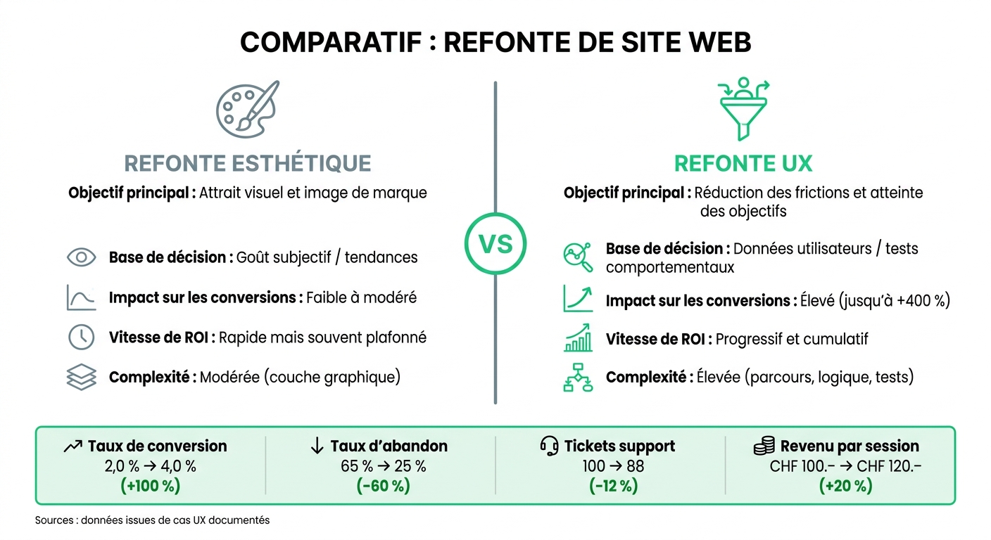
Aesthetic Redesign vs. UX Redesign: Impact on Conversions
Measuring the ROI of a UX redesign starts with a simple point: having a baseline before going live. Without a starting point, it's difficult to show what has changed. Once frictions are corrected, these changes need to be linked to clear business KPIs.
KPIs linking design to revenue
To keep it simple, follow three blocks: revenue, margin, and retention.
Revenue is seen in conversion rate, revenue per session, and average basket in CHF. The margin is tracked with support cost per user or the number of support tickets for 1,000 sessions. This is often underestimated: fixing a defect after production costs much more than spotting it during UX research [1][7]. On the retention side, look at retention rate, churn rate, and NPS [7][3].
In practice, first set a baseline in GA4. Then, use Hotjar or Microsoft Clarity to see where things are stuck: hesitant clicks, broken scrolls, drop-offs at a key step. This is where the numbers start to tell something useful.
Before and after a UX redesign: numerical comparison
A before/after comparison quickly shows if the redesign has hit the right lever. There's no need to overdo it: if the right indicators move, the business effect is almost self-evident.
| Indicator | Before UX optimization | After UX optimization | Business effect |
|---|---|---|---|
| Conversion rate | 2.0% | 4.0% | Potential doubled revenue at constant traffic [1] |
| Abandonment rate | 65% | 25% | Fewer lost leads [7] |
| Support tickets volume | 100 tickets | 88 tickets | -12% operational costs [7] |
| Revenue per session | CHF 100.– | CHF 120.– | +20% on average basket or LTV [1] |
Aesthetic redesign vs. UX redesign: what really makes the difference
Aesthetic visual overhaul and UX redesign are often confused. However, they do not play in the same field. An aesthetic redesign can provide a better first impression. A UX redesign, on the other hand, aims to guide the user more easily to the desired action.
| Criterion | Aesthetic Redesign | UX Redesign |
|---|---|---|
| Main objective | Visual appeal and brand image | Reducing frictions and achieving goals |
| Decision basis | Subjective taste / trends | User data / behavioral tests |
| Impact on conversions | Low to moderate | High (up to +400%) [2] |
| Return on investment speed | Quick but often capped | Progressive and cumulative |
| Complexity | Moderate (graphic layer) | High (journeys, logic, tests) |
Visuals play on perception. UX plays on results. And it is precisely this difference that gives weight to a UX redesign when it comes to business.