Landing page that converts: anatomy of a page with 15%+ conversion
Landing page that converts: anatomy of a 15%+ conversion page
To achieve a conversion rate higher than 15%, a page must be clear, concise, and tailored to its audience. Here are the key points to achieve this:
- Optimized structure: Catchy title, clear subtitle, and a visible call to action (CTA) immediately.
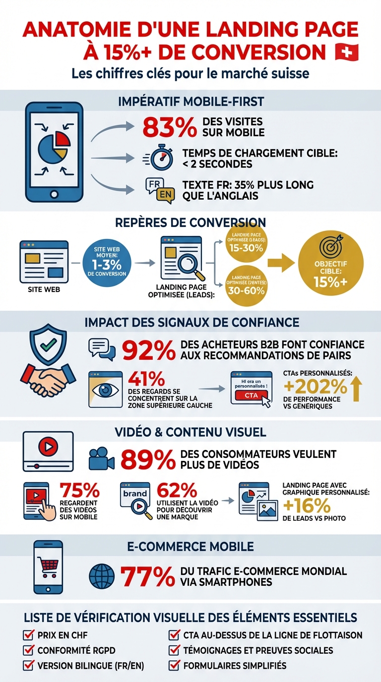
- Mobile-first: With 83% of visits on mobile, the hero section must load quickly and be readable without scrolling.
- Relevant content: Highlight concrete benefits for the user and use local figures (such as CHF or Swiss formats).
- Visitor trust: Testimonials, certifications, and price transparency (in CHF) reassure users.
- Bilingualism: Offer a version in French and English to reach a wider audience in French-speaking Switzerland.
- Speed and performance: A page that loads in less than 2 seconds maximizes engagement.
- Continuous optimization: Analyze visitor behavior using tools like heatmaps and adjust regularly.
Key tip: Simplify forms and reduce distractions to guide visitors to the desired action.
In Switzerland, precision and localization (language, price format, legal compliance) play a crucial role in inspiring trust and converting effectively. A well-designed landing page can turn a simple click into a loyal customer.
Anatomy of a landing page with 15%+ conversion: statistics and key elements
The Anatomy Of A High Converting Landing Page | Conversion Rate Optimization Tips
Hero Section: the first 3 seconds
The hero section, visible right at the page opening, plays a crucial role: it determines whether the visitor stays or leaves immediately. With 83% of visits to landing pages coming from a mobile device [4], it is imperative that this section is perfectly optimized for smartphone screens. The first three elements - the title, subtitle, and call to action (CTA) - should capture attention while confirming the promise of the clicked link [5].
Creating titles that speak to your audience
An effective title focuses on tangible benefits and avoids vague formulations. For the Swiss market, it is essential to adapt the message to local expectations while ensuring consistency between the French and English versions. The title should directly reflect the promise of your advertisement or original link, known as "message match." For example, if a user from Geneva clicks on an ad offering a "Free SEO Audit for Swiss SMEs," the hero section title should reflect this promise, such as: "Get your free SEO audit" in French or "Get Your Free SEO Audit" in English. This direct link reassures the visitor that they are in the right place. Once attention is captured, immediately guide them with a clearly visible CTA.
Strategic positioning of the CTA above the fold
The main call to action should appear right at the page opening, without requiring scrolling [4]. The button should be well-contrasted, of sufficient size, and clearly indicate the action to be taken [4][7]. For bilingual pages, consider the length difference between languages: French text can be 35% longer than its English equivalent [8]. Companies like Amazon and Airbnb adapt their buttons with flexible spaces, allowing the design to adjust to the text length in each language [8].
"The form is positioned at the top of the page, above the fold, which makes the action we want the user to take clear from the outset. The contrasting color draws the user's attention to the end goal, and the descriptive button confirms the action they're about to take." - Adam Lange, CEO, Signpost [4]
This approach fits perfectly into a mobile-first strategy.
Prioritizing a hero design tailored for mobile
For a truly effective hero section, adopting a . In 2019, the clothing brand Twillory collaborated with Aditya Bagri, Digital Automation Manager at WITHIN, to create a simplified mobile version of their landing page. Unlike the desktop version, which included videos and GIFs, the mobile version prioritized loading speed while maintaining visual appeal [4][6]. The goal: ensuring that the title, CTA, and value proposition remain visible "above the fold," i.e., without scrolling, an area that varies depending on screen size [9]. Limit distractions, reduce secondary links, and focus attention on the desired action [9]. This immediate clarity can increase conversion rates by up to 15% or more.
"Our landing page creation strategy is mobile-first, and optimizing for mobile helps us get first-time viewers down the funnel." - Aditya Bagri, Digital Automation Manager at WITHIN [4]
Content Structure: Writing to Convert
After the hero section, organize your page to maximize conversions: a clear value proposition, tangible benefits, compelling social proof, and bilingual messaging. Each element must precisely address the expectations of your Swiss audience. Here are the essential points for writing engaging and persuasive content.
Value Propositions and Highlighting Benefits
Emphasize quantifiable and impactful benefits. For example: "Save 5 hours per week with automated client follow-ups." Use local figures, like 15,000 Swiss companies, and display prices in CHF for maximum relevance. Address specific audience issues from the outset by demonstrating how your solution simplifies their daily life. This direct approach captures attention and establishes an immediate connection with your readers.
Social Proof and Well-Positioned Testimonials
Testimonials and social proof play a key role in purchase decisions as they enhance visitor trust [13][14]. Strategically place logos, certifications, and testimonials near the call to action (CTA). For example, the top left area of a page attracts 41% of views [13]. Take the example of Nori, which integrates testimonials from renowned media like Forbes and The Daily Post directly on its landing page, accompanied by star ratings from verified users [13]. Create a dedicated section for key figures: number of satisfied customers, years of experience, products sold, and logos of trusted partners [12].
"Social proof is the concept that people are influenced by the actions, opinions and experiences of others." - Mariel Pelaez, Content Writer, Thrive Internet Marketing Agency [13]
To maximize impact, ensure that the wording of these elements inspires trust and is tailored to your bilingual audience.
Bilingual Writing for French and English Audiences
As mentioned earlier, careful linguistic and cultural adaptation enhances engagement. To provide a smooth experience, adjust your content to local linguistic specifics. The tone, style, and messages should meet the expectations of French and English users. Perform a specific review for each language and display language names in their native version (English, Français) [8][10][11]. Also, consider that French text is on average 35% longer, which may require adjustments in your interfaces [8][11]. Ensure brand message and consistency in both versions to provide a seamless experience