How to master balance in UI/UX: practical guide
How to master balance in UI/UX: practical guide
Imagine entering a room where all the furniture is grouped on one side. It seems strange, doesn't it? Now, visualize another room where everything is perfectly spaced. You feel a certain tranquility, a balance. This is exactly what balance brings to user interface (UI) design. This article delves into the essence of balance in UI/UX design: what it is, why it is crucial, its types, and how to apply it effectively. Get ready to transform your designs from chaos to clarity.
Balance in UI/UX: What is it?
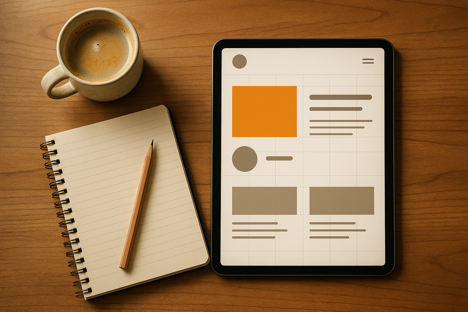
Balance in UI/UX design concerns the visual distribution of elements on a screen so that the layout appears stable and harmonious. Imagine a seesaw: if one side is too heavy, the structure tilts. The same principle applies in design. Imbalance makes an interface uncomfortable, even if users can't always explain why.
Balance is influenced by the visual weight of elements. This "weight" is determined by several factors:
- Size: Larger elements attract more attention.
- Color: Bright, dark, or saturated colors carry more visual weight.
- Contrast: High contrasts capture attention, while low contrasts blend in.
- Proximity: Grouped elements carry more weight.
- Texture and details: The more detailed an element, the more it attracts the eye.
- Position: Objects near the edges appear heavier than those placed in the center.
A balanced design is natural and pleasant: it inspires confidence, clarity, and user-friendliness. Conversely, an unbalanced design creates immediate confusion. As the gestalt principle shows, our brains prefer structured and stable layouts. In other words, balance is one of the keys to success for a positive user experience.
Different Types of Balances in UI Design
UI design is not limited to a single type of balance. There are indeed four main types of balances, each with its advantages and challenges:
1. Symmetrical Balance
Symmetrical balance is based on a layout where each side of a design is identical, like a mirror.
- Advantages: Provides a sense of formality, trust, and stability. Ideal for forms, dashboards, and official applications.
- Disadvantages: Can appear monotonous or rigid if overused.
- Example: Google's login forms, with input fields stacked predictably and centered.
2. Asymmetrical Balance
In asymmetrical balance, both sides are different but visually balanced.
- Advantages: Dynamic and engaging, naturally attracts attention.
- Disadvantages: More challenging to achieve and can appear messy if not mastered.
- Example: Apple's iPhone product page: bold product image on one side and minimalist text on the other.
3. Radial Balance
Elements are arranged around a central point, resembling the spokes of a wheel.
- Advantages: Creates a powerful visual focus, generates energy and movement.
- Disadvantages: Rarely used in practical designs and can seem excessive.
- Example: Apple Watch's activity rings, drawing attention towards the center.
4. Mosaic (or Kaleidoscopic) Balance
Here, all elements have equal weight. No element dominates.
- Advantages: Ideal for grids, galleries, or marketplaces, offering each item equal visibility.
- Disadvantages: Can become overwhelming without proper spacing or a clear focal point.
- Example: Pinterest or Instagram grids, where each post is equally highlighted.
Common Balance Errors and How to Correct Them
Even the most experienced designers sometimes make mistakes that compromise the overall balance. Here are some common pitfalls and their solutions:
1. Overloading One Side of the Screen
Error: Stacking too many elements on one side (e.g., a large image and all the text on the same side).
Solution: Distribute content evenly. For example, place text on one side and an image or icons on the other. Use white space as a tool to visually balance.
2. Overuse of Bright Colors
Error: If everything is in bright colors, nothing stands out!
Solution: Apply a color hierarchy. Follow the 60-30-10 rule: 60% neutral tones, 30% secondary colors, 10% accents. Use saturated hues only for primary actions (like a CTA button).
3. Inconsistent Alignment
Error: Placing elements without adhering to a grid or consistent margins creates a messy impression.
Solution: Use a grid system (e.g., an 8-pixel grid or 12 columns). Ensure all elements are aligned correctly using tools like Figma or Sketch.
4. Poorly Managed Visual Hierarchy
Error: Captions larger than titles, or secondary buttons more visible than primary ones.
Solution: Establish a clear hierarchy: titles should be the largest, followed by subtitles, then body text. Primary buttons should stand out from secondary ones.
Best Practices for Mastering Balance
Here are some practical tips to integrate balance into your designs on a daily basis:
Use a Grid System
A grid helps distribute weight evenly and align elements correctly. Adopt margins and spacings in multiples of 4 or 8 pixels for visual consistency.
Create a Visual Hierarchy
Apply different sizes, colors, and typographies to guide users. For example, on Spotify, the "Play" button is larger and green, while secondary actions are gray and discreet.
Utilize White Space
Empty space is powerful: it provides visual breathing room and highlights content. Look at Google's homepage: a central search bar surrounded by plenty of white space, creating a sense of calm.
Test Your Designs
Do the "zoom out" or "squint test." If an area seems heavier, rebalance by redistributing elements. Finally, check the balance on different devices to ensure a consistent experience on mobile and desktop.
Key Points to Remember
- Visual balance transforms a cluttered interface into a harmonious and functional space.
- There are four types of balances: symmetrical, asymmetrical, radial, and mosaic.
- Common errors include overloading one side, confusing visual hierarchy, or excessive use of bright colors.
- Use a grid system, clear visual hierarchy, and exploit white space to create balanced designs.
- Always test your designs to ensure they are harmonious across all formats.
Conclusion
Balance in UI/UX design is like oxygen: invisible when done well, but undeniable when missing. A harmonious design inspires confidence, enhances user-friendliness, and contributes to a better user experience. So, the next time you create an interface, ask yourself this question: Does my layout exude stability and harmony? If yes, congratulations, you have mastered one of the most essential design principles.
Keep these principles in mind and continue exploring creativity in your digital projects!
Source: "Learn Balance in UI/UX Design | Design Principles for Beginners (Ep. 01)" - Design by Jafar, YouTube, Sep 11, 2025 - https://www.youtube.com/watch?v=_tybeeLQJQM
Use: Embedded for reference. Brief quotes used for commentary/review.