Elements of design that enhance the credibility of Swiss SMEs
Design elements that enhance the credibility of Swiss SMEs
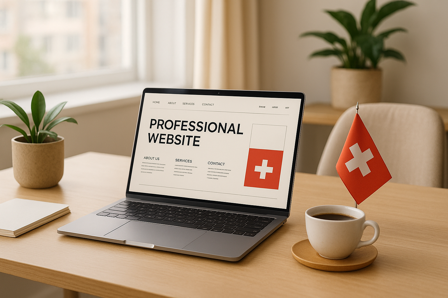
Did you know that 94% of a website's first impressions depend on its design? For Swiss SMEs, meticulous design is not an option, it's a priority. Here are the keys to inspire trust in your customers:
- Clear and professional typography: Use fonts like Helvetica, a symbol of Swiss precision.
- Intuitive navigation: Simplify access to key information with clear menus and logical organization.
- Bilingual and localized design: Adapt your content to reflect Swiss standards (dates, currencies, formats).
- Visible trust signals: Include certifications, customer testimonials, and compliant legal notices.
- Accessibility and security: Offer a responsive, GDPR-compliant, and secure site.
In Switzerland, where quality and reliability are essential, these elements are crucial for building a strong relationship with your customers. Design is not just about aesthetics; it's a strategic tool to establish your credibility.
Professional typography and visual identity
Typography plays a key role in building a professional image, especially in the digital world. In this universe where every detail matters, the choice of typefaces and visual harmony greatly influences users' perception of a company.
Typography and Swiss design principles
Swiss design is based on fundamental principles: simplicity, objectivity, and readability. Inspired by movements like Bauhaus and the 1950s, these principles favor sans-serif fonts that embody clarity and neutrality.
The perfect example? Helvetica, created in 1957, embodies the precision and elegance characteristic of Swiss design. Simon Garfield summarizes this idea well:
"Helvetica is ubiquitous because it fulfills so many demands for modern type."
For Swiss SMEs, opting for fonts like Helvetica, Univers, or Akzidenz-Grotesk (the latter dating back to 1896 and considered a pioneer in its genre) allows them to align with a recognized and respected tradition. These typographic choices send a message of seriousness and reliability.
This principle aligns with a simple philosophy: design should always serve the content, not the other way around:
"Design should focus on the content and not decorative extras."
This approach guides companies towards typographic choices that prioritize readability and effective communication.
Visual coherence in a bilingual context
For a French-English bilingual site, maintaining visual coherence is a challenge both technically and aesthetically. Well-thought-out coherence ensures a smooth experience, regardless of the displayed language.
Some major brands show that a consistent visual identity, combined with subtle adjustments for each language, ensures a harmonious navigation.
For Swiss SMEs, a few essential strategies prove indispensable:
- Anticipate linguistic differences: French is often longer than English, which can affect layout. Flexible design is essential.
- Adapt visuals and icons: Images should consider local sensitivities to remain relevant.
- Respect local formats: Dates, currencies, and times should correspond to Swiss conventions (e.g., DD.MM.YYYY, CHF).
Lionbridge summarizes the importance of this coherence:
"Consistency is key when developing and managing multilingual websites to ensure that all visitors enjoy the same smooth, intuitive UX - regardless of language or locale."
Adopting these practices allows you to meet local expectations while offering a quality user experience.
Adherence to Swiss visual standards
Beyond typography and visual coherence, adhering to Swiss standards enhances a brand's credibility. These aesthetic codes, deeply rooted in tradition, project an image of precision and reliability.
The judicious use of white space is another pillar of Swiss design. It helps structure information, highlight key elements, and ensure visual balance. For an SME, this translates into clean layouts where the essential naturally stands out.
A consistent visual hierarchy across all digital platforms also reinforces brand identity. This consistency inspires trust and simplifies navigation, offering a clear and intuitive user experience.
Swiss design favors a minimalist approach:
"Swiss design is all about reducing visual clutter and that is what makes the message both impactful and memorable."
In a digital world often overloaded, this philosophy helps Swiss SMEs stand out by emphasizing clarity and functionality. By adopting these codes, they build an online image that reflects the values of quality and precision associated with "Made in Switzerland."
By integrating these standards, Swiss companies immediately position themselves as serious and reliable players, while establishing a natural connection with a local audience that recognizes and appreciates these familiar visual codes.
Clean layouts focused on the user
Creating a well-thought-out layout is essential for establishing online credibility. For Swiss SMEs, this goes beyond mere aesthetics; it's a strategic decision. 94% of first impressions are influenced by design, and 75% of consumers judge a website's credibility based on its appearance.
Information organization: prioritizing intuitive navigation
Navigation is at the heart of the user experience. A clear and logical structure helps your visitors quickly find what they're looking for, reducing frustration, bounce rates, and increasing time spent on your site.
To effectively organize information, opt for classic categories like "Home," "About," "Services," and "Contact." This approach meets the expectations of Swiss users, who value simplicity and efficiency. Avoid using complex or technical terms in your menus – simplicity inspires trust.
Take the example of Amazon, which displays its main categories (Electronics, Clothing, Home) in a clear and intuitive menu, with accessible dropdown menus. This allows users to find what they're looking for effortlessly. Similarly, the BBC website offers a simple horizontal navigation, with dropdown menus to access subcategories without cluttering the main interface.
Also, add an effective search bar and ensure your site loads quickly (see). Well-thought-out organization also sets the stage for a design that caters to all devices.
Responsive and accessible design: an essential priority
With over 60% of web traffic coming from mobile devices, having a responsive design is essential. It's not just about comfort; it's a requirement to remain credible and accessible to all your users.
Accessibility goes beyond screen adaptation. It aims to include all users, including those with limitations. In Switzerland, 24% of people aged 15 to 64 live with a permanent disability. This makes accessibility even more crucial.
To make a site accessible, use appropriate HTML tags to structure content, ensure interactive elements can be keyboard-accessible, and provide alternative texts for images. Also, check that the contrast between text and background is sufficient, and test your site with screen readers.
A fluid design ensures that content adapts to all screen sizes while maintaining the order of information. This improves readability and facilitates navigation for everyone. Also, ensure your content remains readable even when users zoom in to 200%.
Once these basics are in place, the judicious use of white space and grids further enhances readability and aesthetics.
White spaces and grid systems: the elegance of Swiss design
White spaces and grids play a key role in visual organization, a fundamental principle of Swiss design. They help structure information while guiding users' attention.
Josef Müller-Brockmann, an iconic figure in Swiss design, summarized their importance as follows:
The grid system is a help, not a guarantee. It allows for a number of possible uses, and each design can seek an appropriate solution to its personal style. But you have to learn to use the grid; it's an art that requires practice.
For Swiss SMEs, using a mathematical grid helps harmoniously structure text, images, and white spaces. This reflects Swiss values of precision and quality associated with "Made in Switzerland."
Minimalism, another pillar of Swiss design, dictates that each element must serve a specific function. Reduce interface elements to the essentials and limit the color palette to sober tones, often monochromatic or slightly varied.
A clear visual hierarchy is also essential. Vary font sizes, weights, and contrasts to naturally guide visitors' eyes to the most important information.
Joshua Porter, an interface design expert, emphasizes:
Clarity is job number one in interface design...to be effective, people must recognize what it is, care about why they would use it, and understand what the interface is helping them interact with.
Finally, prioritize photographs that provide information. This approach aligns with the Swiss philosophy, which values a faithful representation of reality.
By applying these principles, Swiss SMEs can design interfaces that combine local aesthetics and optimal user experience, thereby enhancing their credibility and professional image.
Trust signals and proof elements
Online trust relies on visible and concrete evidence. For Swiss SMEs, displaying relevant trust signals can turn a simple visitor into a loyal customer. These elements reassure and strengthen your credibility.
Certifications and quality labels in Switzerland
Once your site is well-structured, it's crucial to integrate reliability proofs. Certifications and quality labels are effective tools for establishing trust with your customers, partners, and investors. In Switzerland, where precision and quality are essential values, these elements hold a prominent place.
Labels ensure compliance, while certifications demonstrate a deeper commitment to quality.
With over a hundred labels available in Switzerland, the choice may seem complex. Here are some options suitable for different sectors and objectives:
| Certification | Advantages | Ideal for |
|---|---|---|
| EcoEntreprise | Based on ISO 26000 | SMEs aiming to strengthen their local reputation |
| B Corp | International recognition | Companies with global ambitions |
| EcoVadis | Multi-criteria evaluation | Companies collaborating with large enterprises |
| ISO 14001 | Environmental management | Companies with significant environmental impact |
| Fairtrade | Fair trade | Consumer goods sector |
Corporate Social Responsibility (CSR) is becoming increasingly important. In 2021, the Swiss Confederation strengthened its CSR commitment with an action plan for 2020-2023. A notable example: in 2024, My Sustainable Company obtained CSR certification and several labels like EcoEntreprise, B Corp, and EcoVadis.
To choose the right certification, align it with your business goals, sector, and target audience.
Customer testimonials and references
Customer testimonials and references are powerful social proofs that reassure your prospects. For Swiss SMEs, it's essential to adapt this content to local expectations while maintaining an international reach.
Present your testimonials in different formats: short quotes with photos and company names, detailed case studies, or videos of satisfied customers. Adapt the content to your audience: in French for Romandy, in German for the Swiss-German market, and in English for international markets.
An effective example: an SME validated by a major player in the industry immediately strengthens its credibility.
Diversify your testimonials by including feedback from local customers, international partners, and collaborators. This approach reflects the diversity of the Swiss market and enhances your overall credibility. These testimonials, combined with certifications, create a reassuring digital environment.
Security and data privacy compliance
Data protection is more than just a legal obligation; it's an opportunity to build trust. For Swiss SMEs, this issue is crucial, especially considering that one in three has been a victim of a cyberattack.
Clearly display your compliance with the Swiss Federal Data Protection Act (DPA) and the EU's General Data Protection Regulation (GDPR), both of which apply extraterritorially. A risk-based approach allows you to tailor your measures to your specific needs.
Here are the essential elements to include on your site:
- Security and transparency: Display secure payment logos, protection icons, and your complete contact details (address, phone, secure contact form).
- Privacy policy: Ensure it is accessible and always up to date.
- Agreements with providers: If you collaborate with third parties, sign a Data Processing Agreement (DPA).
- GDPR representative: For companies operating in the EU, designate a GDPR representative in the European Union.
Frameworks like ISO 27001 help SMEs strengthen their cybersecurity and educate their teams. By investing in regular training, you enhance your organization's resilience against cyber threats. Collaborating with legal experts, technology providers, and industry groups can also provide valuable resources to navigate compliance challenges.
By making these trust signals visible and strategic, you create a reassuring atmosphere that encourages your visitors to take action. This framework perfectly reflects Swiss values of quality, transparency, and reliability.
Bilingual and local adaptation strategies
In Switzerland, SMEs face the challenge of addressing diverse audiences. An effective bilingual strategy goes beyond translation: it aims to create a user experience that considers the cultural and technical specificities of each market.
Creating a smooth transition between languages
A well-thought-out language selector is essential for any multilingual site. It should be placed in a visible location, such as the top corner or in the mobile menu.
- Display languages in their native form (e.g., "Français," "Deutsch") to respect linguistic identity and facilitate identification.
- Avoid flags, which symbolize countries, not languages. Prefer textual options or ISO codes.
Let's take some examples: Decathlon Switzerland uses Weglot to offer Italian and English versions via a compact dropdown menu. Gardette Industries opts for highly visible language buttons for French and English. Calvin Klein, on the other hand, offers a modal window accessible via a