Design system: building visual coherence at the organization level
Design system: building visual coherence at the organization's scale
In a complex digital environment, ensuring visual coherence is essential, especially for Swiss companies operating on multilingual and multiple platforms. A design system centralizes visual elements (colors, typography, components) and usage rules to standardize interfaces. This reduces inconsistencies, speeds up development, and enhances the.
Key points:
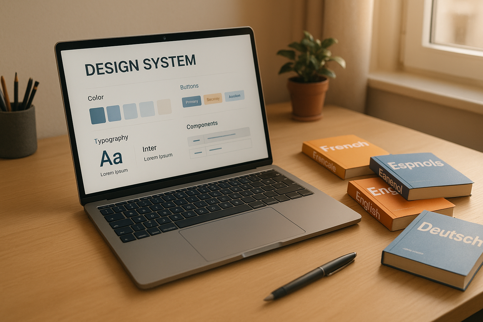
- What is a design system?
A unified library grouping colors, typography, reusable components, and clear documentation. - Specific challenges in Switzerland:
Multilingualism (French, German), strict standards (accessibility, Swiss GDPR), and local adaptations. - Recommended tools:
Figma for design, Storybook for technical documentation. - Methodology:
Needs analysis, creation of flexible systems, and continuous management with collaborative governance.
Expected results:
- Harmonized interfaces across all channels.
- Reduction of errors and development costs.
- Improved adoption through clear documentation and components optimized for Swiss languages.
A well-thought-out design system is a lever for Swiss companies wishing to combine efficiency and uniformity while respecting local specificities.
Design System: why and how? | Webinar
Fundamental elements of a design system
A well-designed design system relies on three essential elements that ensure both visual coherence and long-term adaptability. Here is a detailed overview of these pillars.
Design tokens and reusable UI components
Design tokens form the basis of a design system. These are variables that group essential visual properties: colors, font sizes, spacings, border radii, and shadows. By centralizing these elements, visual inconsistencies are eliminated.
In a bilingual context like Switzerland, tokens play a crucial role. For example, spacings must be flexible enough to adapt to length variations between languages. A button designed to display "Confirm" should also accommodate "Bestätigen" while maintaining a harmonious appearance.
Next, reusable UI components transform these tokens into concrete elements. Buttons, form fields, cards, or modals become standardized blocks, integrating all their states (normal, hover, active, disabled) and variations according to the context.
Documentation guidelines for effective collaboration
For design tokens to be fully utilized, clear and well-structured documentation is essential. It should cover three main aspects:
- Conceptual: explaining the philosophy and principles of the design system.
- Functional: detailing each component, its variants, and use cases.
- Technical: providing code, integration specifications, and best practices.
Regularly updated documentation ensures that all teams, even distributed ones, work in perfect synchronization.
Respect for Swiss standards
A design system intended for the Swiss market must meet specific requirements. This includes considerations related to data protection (such as consent mechanisms), adapted typographic conventions (for example, a date format like 15.08.2025 or a numeric separator such as 1'000.50 CHF), and compliance with WCAG 2.1 level AA guidelines.
Components must offer sufficient contrast, enable full keyboard navigation, and consider cultural sensitivities, whether for French-speaking or German-speaking Swiss users. These adjustments ensure an inclusive and tailored experience for all Swiss audiences.
Creating and managing UI components
Creating consistent UI components requires a rigorous methodology and well-suited tools. Among them, Figma and Storybook stand out as an essential duo. Together, they allow for designing, documenting, and maintaining design systems efficiently. This approach aligns with an overall strategy to harmonize interfaces and optimize their management after implementing design tokens and reusable components.
Creating components with Figma
Figma is a powerful tool for design thanks to its master components and variants features. To design an effective component, start by defining its base state, then create variations tailored to the project's specific needs.
A clear nomenclature is essential for organizing your components. Use a hierarchical structure like Button/Primary/Large or Form/Input/Error. This organization facilitates search and ensures consistent use within the team. Also, remember to test your components with content in French and German to anticipate linguistic variations.
Component properties allow managing aspects like size, state (normal, hover, disabled), or type (primary, secondary, tertiary). This avoids duplicating similar elements and simplifies maintenance.
Figma's Auto Layout is a major asset for handling content variations. For example, a button configured with Auto Layout automatically adjusts to the text length, whether it's "OK" or "Zurück zur Hauptseite." This flexibility is crucial for multilingual interfaces, where texts can vary significantly in length.
Documenting components with Storybook
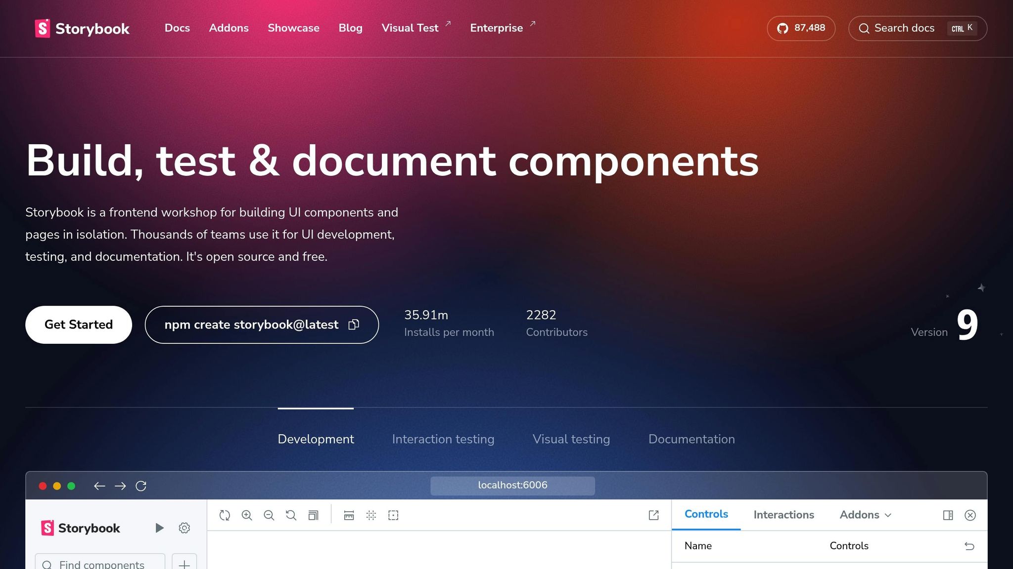
If Figma is the preferred tool for visually structuring concepts, Storybook ensures their technical implementation.
Storybook transforms coded components into an interactive library accessible to the entire team. Each component is presented in its different states, accompanied by its technical documentation and use cases.
Its main advantage lies in the ability to test components in isolation. This allows developers to examine each state without navigating through the entire application. This approach speeds up development and facilitates anomaly detection.
Stories are another key asset. They document each variant of a component. For example, for a form field, you can create stories for the empty, filled, error, or disabled state. These stories also serve as a valuable reference for designers.
The integration of addons further enriches the experience. The Accessibility addon, for example, automatically checks compliance with WCAG standards, a crucial aspect to meet Swiss accessibility requirements. On the other hand, the Controls addon allows modifying component properties in real-time, simplifying testing and understanding.
Figma vs. Storybook: comparison of component management
| Aspect | Figma | Storybook |
|---|---|---|
| Usage phase | Design and prototyping | Development and documentation |
| Collaboration | Designers, product managers | Developers, QA, designers |
| Components | Visual, interactive in prototype | Functional, code-based |
| Maintenance | Manual updating of designs | Synchronization with actual code |
| Testing | User testing, visual validation | Unit tests, accessibility |
| Accessibility | Manual contrast checks | Automated WCAG checks |
| Multilingualism | Manual management of variants | Automated tests with multiple languages |
Seamless collaboration between Figma and Storybook
The combined use of Figma and Storybook creates a smooth and efficient workflow. Designers use Figma to design and refine ideas, while developers implement and document them in Storybook. These two tools complement each other perfectly: Figma influences technical choices, and Storybook highlights real constraints that can guide design decisions.
For Swiss companies, this method helps manage the complexity of multilingual interfaces while ensuring visual and functional coherence across all digital platforms.
Team collaboration and system governance
To maintain component consistency in the long run, close collaboration and well-defined governance are essential.
Connecting design and development workflows
A shared documentation detailing component behaviors and constraints plays a key role in aligning design and development. Design tokens (like --color-primary-500) facilitate precise synchronization between tools like Figma and code.
Regular reviews between designers and developers quickly identify gaps between the initial vision and implementations. Weekly sessions are particularly useful for validating new components and discussing necessary improvements. Additionally, automating handoffs, using tools like Figma to Code or integrations with Storybook, reduces errors and speeds up development cycles. For teams working on multilingual projects, it's crucial to consider text length differences between French and German during the design phase.
This technical coordination establishes a solid foundation for effective governance.
Governance models for evolving design systems
The chosen governance model directly influences a design system's ability to evolve harmoniously. For Swiss organizations managing multilingual and multi-platform projects, federated or hybrid models are particularly suitable.
A federated model allows distributed teams to contribute autonomously, while a hybrid model combines a central team responsible for core components with specialized teams developing extensions. This configuration promotes both innovation and coherence.
Each new component or modification undergoes strict validation to ensure its technical quality and compliance with existing standards. Furthermore, rigorous version management allows the design system to evolve without disrupting existing implementations.
Effective governance relies on clear communication through dedicated channels like newsletters or presentations to encourage adoption of updates.
At EWM SA, this structured approach enables us to manage complex projects involving multiple languages and platforms while maintaining a visual coherence that reflects the excellence of our work.
Localization and accessibility for Swiss audiences
Creating a design system for Switzerland goes beyond simple translation. It involves adapting the user experience to linguistic particularities, local preferences, and regulatory requirements.
Adjusting components for multiple languages
In Switzerland, designing UI components for fr-CH and de-CH audiences requires considering text length differences. For example, German phrases can be up to 30% longer than French ones. This can pose challenges for buttons, menus, and forms.
To manage these variations, use flexible tokens like --button-padding-horizontal: 1.5rem or --button-min-width: 120px. These adjustments allow components to adapt without compromising readability or layout.
Typography is another key aspect. Some fonts work well in French but may pose issues for specific German characters, such as umlauts (ä, ö, ü) or the eszett (ß). It's essential to test texts in both languages before final validation.
For multilingual forms, user preferences vary. Swiss German users appreciate detailed instructions, while French speakers prefer a more concise style. These differences directly influence the design of error messages, labels, and contextual help.
These adjustments ensure a smooth user experience well adapted to local needs.
Accessibility for a multilingual audience
Accessibility in Switzerland presents unique challenges that go beyond WCAG 2.1 standards. With multiple languages at play, adopting inclusive solutions for all user types is crucial.
Color contrasts must be checked for each language, as some combinations can affect readability depending on the displayed text. While a minimum contrast ratio of 4.5:1 is recommended, aiming for a higher ratio (7:1) is ideal for complex and multilingual interfaces.
Keyboard navigation must also be adapted to QWERTZ (used in Swiss German) and AZERTY (in Swiss French) layouts. Keyboard shortcuts should consider these variations to avoid conflicts with special characters specific to each language.
Screen readers must correctly recognize the language through the lang attribute (e.g., lang="fr-CH" or lang="de-CH"). This ensures faithful text pronunciation, enhancing the experience for visually impaired users.
Cognitive accessibility plays a central role. Swiss users, often multilingual, may switch between languages according to their preferences. Interfaces must remain consistent and intuitive, even when linguistic content changes.
Respecting Swiss localization standards
To offer a user experience aligned with local expectations, it's essential to integrate Swiss formats in all display elements.
The Swiss currency format uses the Swiss Franc (CHF) with specific rules. The CHF symbol comes after the amount (e.g., 1'500.00 CHF). Thousands are separated by an apostrophe, a convention that must be respected in all amount displays.
Dates follow the day.month.year format (15.08.2025), and times use the 24-hour format (14:30). Decimals are indicated by a comma (3,14), and thousands by an apostrophe (1'000). These conventions must be applied in all calendar, input, and time display components.
Regarding units of measurement, the metric system is the norm. Temperatures are expressed in Celsius (°C), distances in kilometers and meters, and weights in kilograms. Interfaces should default to these units, with conversion options if necessary.
At EWM SA, we pride ourselves on designing digital experiences aligned with Swiss user expectations. Our fr-CH and de-CH solutions offer optimal accessibility and respect local preferences while remaining flexible for international deployments. This attention to detail ensures consistent and effective interfaces across all digital touchpoints.
sbb-itb-454261f
Measuring success and improving the system
A well-structured design system changes the game in managing digital projects. It's not just a collection of graphic components but a real strategy that harmonizes the user experience across all touchpoints.
In Switzerland, where multilingual challenges between French, German, and Italian strongly influence the user experience, companies see tangible benefits: improved efficiency in development and enhanced coherence in a complex market.
The success of a design system relies on three key elements: well-documented and reusable components, collaborative governance engaging all teams, and continuous evolution based on measurable data. Tools like Figma and Storybook play a crucial role in providing a clear structure to this process. These solid foundations allow for a tailored implementation, as proposed by EWM SA.
With over 10 years of experience, EWM SA supports Swiss and international companies by understanding the specificities of the Swiss market: multilingual requirements, precision, and high standards. Our collaborative approach ensures design systems that adapt to your needs while respecting your brand identity and strategic goals.
A design system is more than just a tool: it's an investment that evolves over time