Mobile-first design: why it's essential for your Swiss website
Mobile-first design: why it's essential for your Swiss site
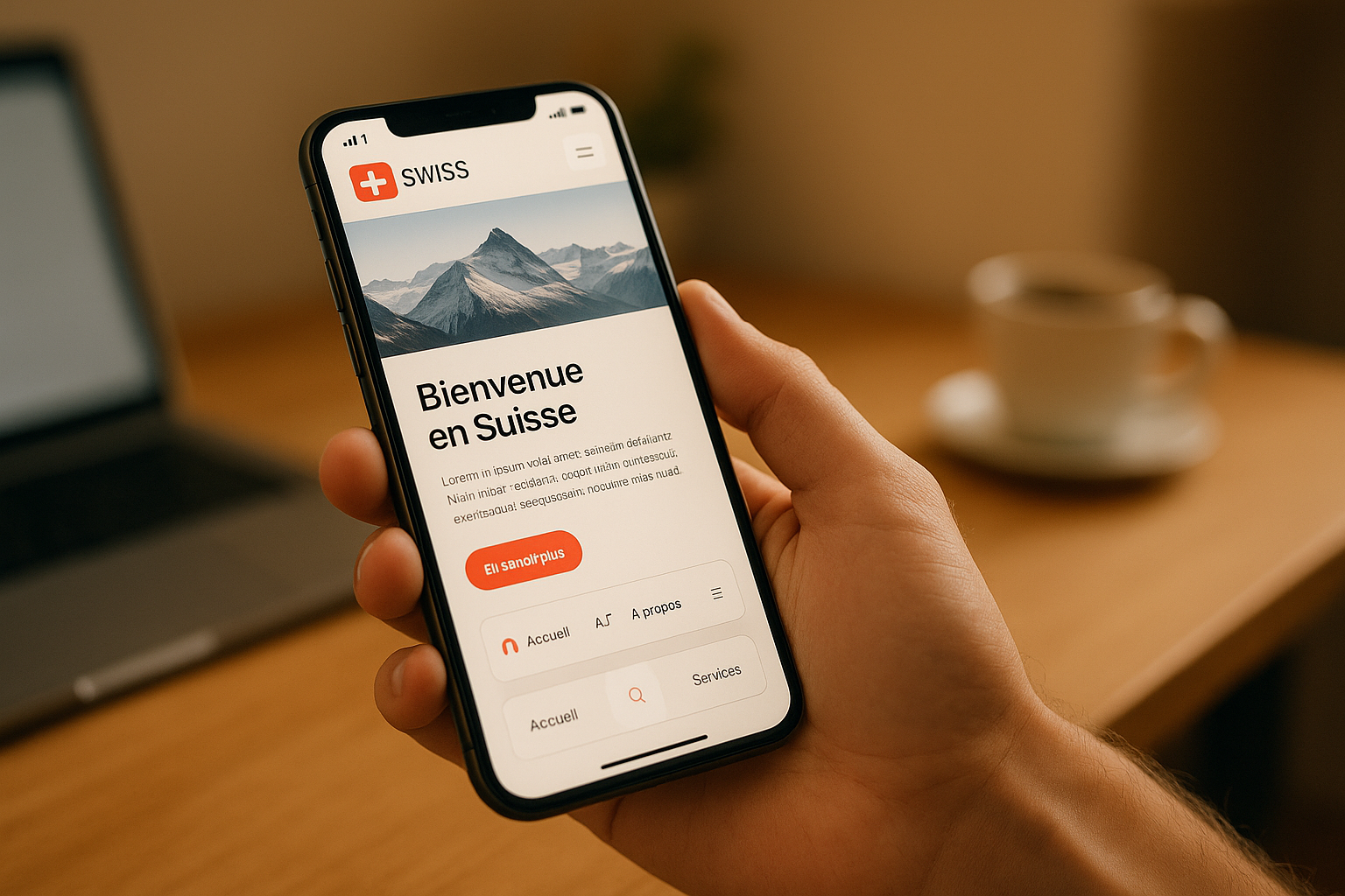
Did you know that 96% of Swiss people own a smartphone and that 38.4% of the comes from mobile devices? These numbers highlight the importance of adopting a for your site.
Here's why this approach is crucial:
- Better SEO: Google favors mobile-first indexing.
- Smooth navigation: A optimized for mobile screens.
- High conversions: Mobile users more often complete their purchases.
- Local adaptation: Multilingual support and Swiss formats (CHF, dates, etc.).
Concrete example: McDonald's Jobs doubled its clicks and reduced its bounce rate by 38% after a mobile-first redesign.
To succeed:
- Prioritize a clean and fast design.
- Respect Swiss formats (CHF, DD.MM.YYYY).
- Optimize performance (loading times, compressed images).
A well-designed mobile-first site meets the expectations of Swiss users and improves your online results.
Mobile First Design | Importance and Key Elements Covered
The fundamentals of mobile-first design
Mobile-first design is based on key principles to offer an optimal experience on mobile devices. In 2024, with over 58% of global web traffic generated by these devices, it becomes essential to apply these best practices.
Content Hierarchy
Users spend an average of 3 hours and 15 minutes per day on their smartphones. This means that information must be presented clearly and intuitively.
Here are some tips for organizing content effectively:
| Element | Recommendation | Impact |
|---|---|---|
| Headings | Short and descriptive | Improves readability |
| Paragraphs | Maximum of 3-4 lines | Facilitates quick reading |
| CTA | Strategic placement | Increases conversions |
| Navigation | Hamburger menu | Simplifies access |
Once the structure is defined, focus on touch interactions tailored to mobile screens.
Mobile Touch Design
To ensure smooth use on mobile, maintain a minimum size of 44 pixels for touch areas.
Key points for successful touch design:
- Prefer buttons and links measuring at least 48×48 pixels.
- Ensure sufficient spacing between interactive elements to avoid accidental clicks.
- Eliminate hover-based interactions, which do not work on mobile.
- Incorporate natural gestures like swiping for easy navigation.
Once these ergonomic aspects are in place, move on to a for a consistent experience across all screens.
Responsive Design Basics
After structuring the content and optimizing touch ergonomics, adapt the design to all screen sizes. In Switzerland, multilingualism reinforces the importance of a flexible layout.
Here are the essential technical elements:
-
Flexible grids
Use grids that automatically adjust to screen sizes. Relative units like rem or em are ideal for defining breakpoints. -
Responsive images
Compress images to reduce loading times. In 2023, 57% of internet traffic came from mobile devices. -
Mobile performance
Improve site speed by compressing images, minifying code, loading non-essential elements asynchronously, and caching static resources.
Test your site on multiple devices and in different languages to ensure a consistent and enjoyable experience.
Building a Mobile-First Site: Step by Step
Creating a mobile-first website requires a thoughtful approach to provide a smooth and pleasant user experience. In Switzerland, where 38.4% of web traffic comes from mobile devices, this strategy has become essential.
Priority to a Clean Design
To succeed with a mobile-first site, start by laying a solid foundation. Here are some key elements to keep in mind:
| Element | Recommendation | Impact |
|---|---|---|
| Structure | Simplified navigation | Facilitates access to content |
| Content | Short and clear texts | Improves readability |
| Interactions | Buttons of at least 48 px | Optimizes touch ergonomics |
| Images | WebP format | Reduces loading time |
A simple design alone is not enough. Performance plays a crucial role. For example, every additional second of loading time can lead to a 20% decrease in conversions. Once the structure is defined, focus on performance optimization to ensure fast and intuitive navigation.
Mobile Speed Optimization
Loading speed is a decisive factor: 53% of users abandon a site if it takes more than 3 seconds to load. To improve speed, apply these best practices:
- Use modern image formats like WebP.
- Reduce file sizes by minifying HTML, CSS, and JavaScript code.
- Implement a caching system.
- Integrate a CDN to accelerate content distribution.
- Prioritize loading visible elements on the screen.
These adjustments can transform the user experience and reduce abandonment rates.
Essential Tests for a Mobile-First Site
After optimizing your site, test its effectiveness on multiple fronts. Here are the main points to check:
-
Performance tests
Analyze Core Web Vitals metrics, including:- Largest Contentful Paint (LCP)
- First Input Delay (FID)
- Cumulative Layout Shift (CLS)
-
Linguistic tests
In Switzerland, with its multiple official languages, adapt your site to each audience:- Check the correct display of special characters.
- Ensure translation consistency.
- Test forms in all available languages.
-
Usability tests
Test your site on different mobile devices to ensure intuitive and smooth navigation.
An illustrative example: Walmart optimized its mobile site with AMP technology, reducing its loading time by one second. The result? A 2% increase in conversions. Proof that targeted adjustments can have a direct impact on performance.
With these steps and tests, you ensure offering a mobile-first experience tailored to Swiss user expectations.
Swiss Market Requirements
Swiss Linguistic Standards and Formats
With four national languages, Switzerland requires precise and rigorous localization. To succeed, it is essential to respect its technical and cultural specificities.
| Element | Local Standard | Example |
|---|---|---|
| Currency | CHF | CHF 1,499.90 |
| Date | DD.MM.YYYY | 19.05.2025 |
| Numbers | 1,234.56 | 10,000.00 |
| Measurements | Metric | 100 km, 25 °C |
These local formats play a key role in the user experience and . Localization goes beyond translation: it must reflect local expectations. In 2021, a study showed that 52% of users abandon a mobile app if localization is poorly done.
To meet Swiss expectations, it is important to:
- Integrate local payment systems like TWINT.
- Ensure correct handling of special characters (ä, ö, ü, é, è, à).
- Respect specific typographic conventions.
"The idea of localization is to create a seamless experience that transcends cultures, and word-for-word translations do not do justice to that." - Userpilot Team
Multilingual SEO Optimization
In addition to respecting local formats, a site must be optimized for search engines to ensure increased visibility. A multilingual SEO strategy requires a solid technical foundation.
| Component | Implementation | Impact |
|---|---|---|
| URL Structure | /fr/, /de/, /it/ | Simplified navigation |
| hreflang Tags | Self-referential | Precise language targeting |
| Content | Locally adapted | Improved relevance |
For maximum efficiency, opt for a subfolder structure:
- example.ch/fr/ for French
- example.ch/de/ for German
- example.ch/it/ for Italian
This strengthens domain authority while allowing precise language targeting. hreflang tags should be configured bidirectionally to avoid duplicate content issues.
"TBH hreflang is one of the most complex aspects of SEO (if not the most complex). It seems as simple as a meta-tag, but it quickly becomes complicated." - John Mueller, Google
The results show that well-done localization can transform a market. For example, Lucidchart recorded a 200% growth in one year in the Latin American market after correctly localizing its interface.
These adjustments, combined with a mobile-first approach, ensure an optimal experience and effective SEO in the Swiss market.
sbb-itb-454261f
Conclusion: Mobile Design Trends in Switzerland
In Switzerland, the transition to a mobile-first approach is now a reality, as evidenced by online shopping habits. Swiss consumers increasingly use their smartphones to search for products and complete purchases.
Four major trends currently shape mobile design in the country:
| Trend | Impact |
|---|---|
| Minimalist design | Smoother navigation and fast loading |
| Personalized experience | Content tailored to local preferences |
| Adaptive dark mode | Improved visual comfort |
| Energy optimization | Reduced energy consumption |
These trends directly influence the user experience. Take the example of Mofakult, a Swiss company that adopted a mobile-first strategy. After launching their site adapted to national languages, they saw an 83% increase in new customers. By reducing their loading time to less than 100 milliseconds, they demonstrated the impact of technical optimization on performance.
"Designing mobile-first forces us to focus on essential content and intuitive navigation. It eliminates distractions and improves user satisfaction." – Sarah Morales, UX Designer, LA Tech Agency
To succeed in the , companies must integrate key elements:
- A mobile-first strategy that considers the four national languages
- Technical optimization ensuring ultra-fast loading times
- An intuitive interface respecting local standards and cultural specificities
These efforts underline the importance of a well-thought-out mobile-first approach to meet Swiss user expectations and secure a prominent place in the digital landscape.
FAQs
How can I adapt my mobile-first site to Swiss linguistic and cultural standards?
To ensure your mobile-first site meets Swiss expectations, start by adapting to local formats. Display prices in Swiss Francs (CHF), using a comma for decimals and a space for thousands (e.g., 1,234.56 CHF). Also, follow Swiss formats for dates (DD.MM.YYYY) and time in a 24-hour system.
Ensure the content is adapted to Swiss French, respecting local spelling rules and considering cultural sensitivities. This includes references, expressions, and styles that resonate with the Swiss audience. Finally, thoroughly test your site to ensure it is intuitive, functional, and meets local user expectations. This will enhance their trust and improve their experience.
What are the key benefits of a mobile-first design to increase the conversion rate of my site in Switzerland?
Why adopt a mobile-first design in Switzerland?
Choosing a mobile-first design is not just a trend, it is a necessity to maximize the conversion rate of your site, especially in a country where mobile usage is predominant like Switzerland. Here are some reasons explaining its importance:
- Reduced loading times: Mobile-designed sites load quickly, reducing bounce rates and improving the overall experience.
- Simplified navigation: An intuitive interface, designed for mobile screens, facilitates interaction and encourages users to explore your content further.
- Better visibility on search engines: Mobile-optimized sites are favored by algorithms, which can increase your organic traffic.
In Switzerland, integrating local details, such as date or currency formats, can also enhance visitor trust. This type of customization shows that you understand their needs, thereby increasing conversion chances. With a well-executed mobile-first strategy, you not only convert visitors into customers but also into .
How to optimize the loading speed of a mobile-first site in Switzerland?
How to improve the loading speed of a mobile-first site in Switzerland?
For your mobile-first site to offer a smooth and fast experience, there are key steps to follow. Start by optimizing your images: compress them and adopt modern formats like WebP, which provide better quality with