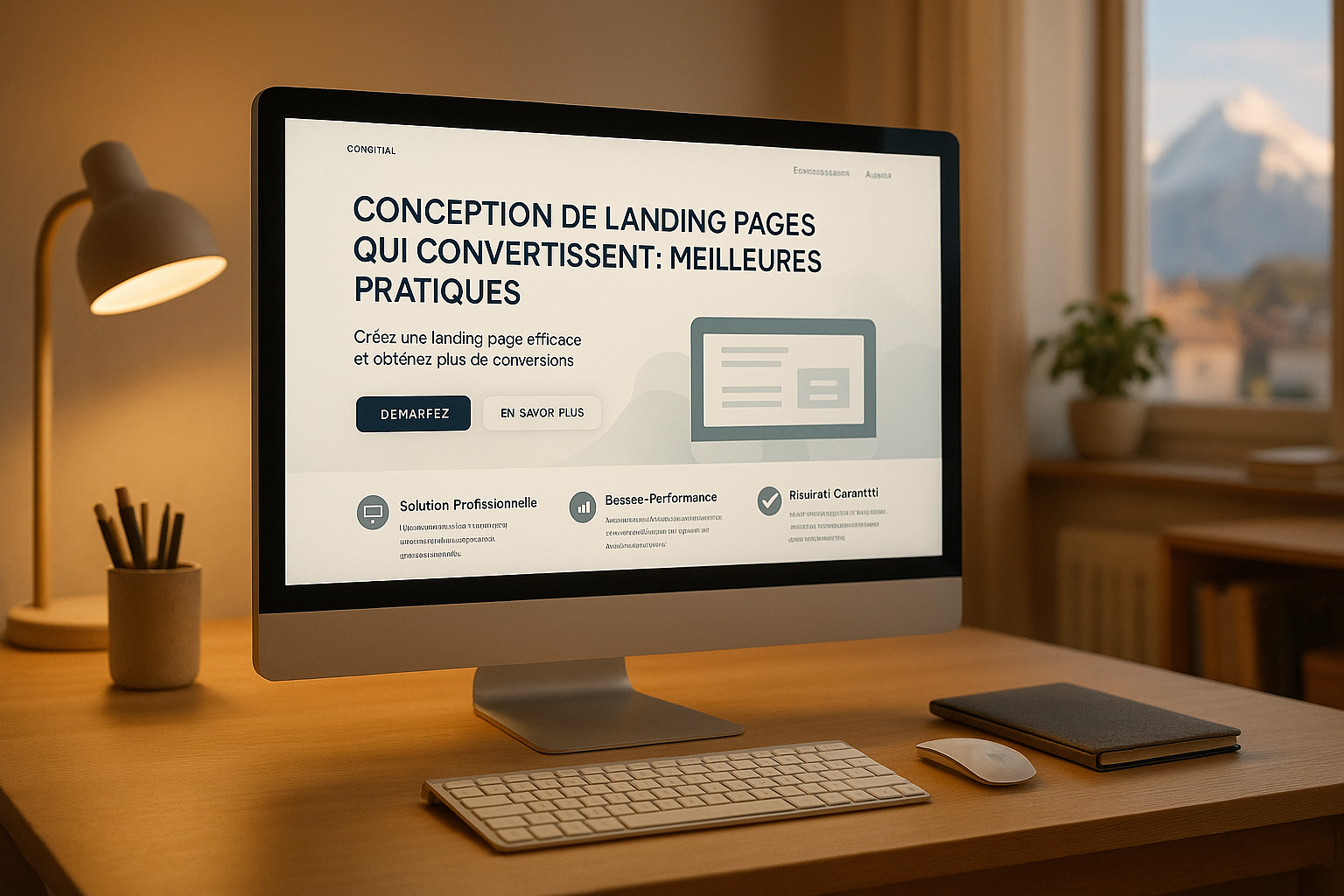
Design of landing pages that convert: best practices
Designing Landing Pages That Convert: Best Practices
A well-designed landing page can turn your visitors into customers. Here's what you need to know to optimize your pages and:
- Essential Elements: A catchy title, a clear value proposition, social proof (testimonials, certifications), and a compelling call to action (CTA).
- Local Adaptation: In Switzerland, a multilingual approach is crucial. Adapt your pages according to local languages (French, German, Italian) and cultural expectations.
- Mobile Optimization: With a mobile penetration rate exceeding 120%, your pages must be fast, readable, and tailored to small screens.
- Privacy Standards: Respect privacy standards and display security guarantees to build trust.
- Clean Design: Prioritize a simple layout with white spaces, smooth visual paths (F or Z), and local formats (e.g., CHF 1,000.50, date DD.MM.YYYY).
Quick Numbers Recap:
- 50%: Conversion rate of top landing pages.
- 9 out of 10 Swiss: Prefer browsing in their native language.
- 40%: Will leave a page that takes more than 3 seconds to load.
In Switzerland, an effective landing page relies on precision, simplicity, and local adaptation. Follow these principles to maximize your results.
Key Elements of High-Converting Landing Pages
Creating Clear and Impactful Calls to Action (CTA)
To maximize the effectiveness of your calls to action, use direct language and powerful action verbs like get or start. These choices highlight immediate value for the user. Also, play with colors: blue can inspire trust, while black conveys a premium image. Place your CTAs strategically, ideally above the fold, which can increase conversions by 317%.
For a bilingual Swiss audience, adapt your CTAs in both languages while maintaining their impact. An effective tip is to use the first person in your messages. For example, replacing "Get your free template" with "Get my free template" has shown a 90% increase in clicks. Concrete examples? The company 310 Creative uses the CTA "Help Scale My Revenue" to clarify its offer, while Evernote opts for a bright green "Get Evernote free" button that immediately grabs attention.
These techniques help maximize the visibility and effectiveness of your messages at first glance.
Optimizing Above-the-Fold Content
The content visible upon page opening is crucial. Include a catchy title, a clear value proposition, and, if relevant, a registration form. With 77% of retail site traffic coming from smartphones and two-thirds of online orders placed on mobile, it's essential to adopt a mobile-friendly approach.
Your main title should immediately capture attention by highlighting the main benefit of your offer. Add a subtitle that specifies your value proposition and accompany it with a high-quality hero image in line with your brand. For Swiss companies, include appropriate reassurance elements: logos of recognized local companies, GDPR compliance mentions, or security certifications.
The agency Square illustrates this approach well by using videos of real companies around their CTAs. Unlike static pages, this strategy brings dynamism while keeping buttons clearly visible.
Once this section is optimized, it's time to focus on visual hierarchy to effectively guide visitors.
Using Visual Hierarchy and User-Friendly Layouts
A well-thought-out layout is essential to provide a smooth and intuitive navigation. White space, often underestimated, plays a key role here. As Jan Tschichold points out:
"White space should be considered as an active element, not as a passive background."
By leaving enough white space, you improve readability and increase conversions. Follow natural reading patterns like F or Z paths to guide the visitor's eye.
Line length is also important: around 70 characters per line offer optimal reading comfort. Limit your paragraphs to five or six sentences, about 200 characters, to maintain readers' attention. Use visual principles like proximity and similarity to group related information, making the page more intuitive.
Ryan McHugh, CRO Director at NP Digital, perfectly summarizes the importance of simplicity:
"One of the biggest mistakes site owners make when creating landing pages is not having a clear and singular goal for the page. Landing pages should have a primary goal, whether it's capturing email addresses, getting sign-ups, or making a sale. When a page contains too many distractions, including links, navigation options, or too much information, it can confuse visitors and decrease conversions. Keep your content blocks concise and relevant. Focus on a clear value proposition and ensure a consistent and action-oriented call to action." – Ryan McHugh, CRO Director at NP Digital.
Localization Methods for Swiss Audiences
Bilingual Content Structure and Design
To succeed in the Swiss market, where multiple languages coexist, it's essential to structure your landing pages considering linguistic and cultural specificities. Did you know that 65% of consumers prefer browsing sites in their language, even if the content quality is lower? And 40% of them outright avoid buying on a site in another language.
Consistent design is essential. Using a single template for all languages helps maintain a strong . Place the language selector in easily accessible areas, such as the header or footer, and ensure that languages are displayed in their native form (e.g., "Français" instead of "French").
A concrete example: on 25.04.2025, The Growth Agency collaborated with Aqua Swim Academy, a Swiss company, to create bilingual English-French landing pages via HubSpot. These multilingual pages were designed to adapt to local dialects while allowing visitors to easily switch between languages. Each version collected specific data, offering a smooth and personalized experience.
Design and Messages Adapted to Swiss Users
Once the bilingual structure is in place, it becomes crucial to adapt visuals and messages to meet the expectations of Swiss users. This involves reflecting local values such as precision, quality, and reliability. These adjustments enhance trust and increase conversions.
Visuals should represent Switzerland's cultural diversity while respecting aesthetic sensitivities specific to each linguistic region. For example, images showing alpine landscapes or typical urban scenes can deeply resonate with users.
Phrase summarizes this approach well:
"The goal of localization is to create a user experience that feels specifically designed for a language and culture. Ideally, no user should detect that the original product may come from a completely different cultural context."
For Swiss audiences, this approach is particularly relevant. Well-thought-out localization can turn a simple visitor into a loyal customer.
Formatting According to Swiss Standards
Adhering to local formatting standards is a key step in gaining user trust and offering a credible presentation. Here are some Swiss standards to integrate:
| Element | Swiss Format | Example |
|---|---|---|
| Currency | CHF with decimal point | CHF 2,500.50 |
| Dates | DD.MM.YYYY | 15.06.2025 |
| Numbers | Apostrophe as thousands separator | 10,000 |
| Decimals | Comma for numbers, period for currencies | 2,500.50 or CHF 2,500.50 |
For currencies, the decimal point is mandatory, even if the comma is used for other types of numbers. This distinction is particularly important in sectors like or finance, where formatting errors can cause confusion.
From a technical perspective, use libraries like ICU or .NET to ensure correct display of Swiss formats. In web development, the HTML attribute lang (e.g., <html lang="fr-CH">) and tools like Intl.NumberFormat in JavaScript are your best allies for managing number formats.
For date input fields, the HTML5 element <input type="date"> automatically adapts to users' local settings. Always save dates in ISO 8601 format for universal compatibility, then convert them for display according to local preferences.
Technical Best Practices for Performance and Compliance
Optimizing Page Loading Speed
Page loading speed is a key element to ensure the effectiveness of your landing pages. Did you know that 40% of visitors leave a site if it takes more than three seconds to load? Additionally, 70% of consumers state that loading time influences their purchasing decision. In Switzerland, where user expectations are high, fast speed is essential.
Ideally, maintain a loading time between 0 and 4 seconds to maximize conversions. To achieve this, several technical approaches can be implemented.
- Image Optimization: Compress your visuals and use modern formats like WebP, particularly suitable for mobile devices. Ensure each image is resized according to its usage to avoid unnecessary processing.
- Reducing HTTP Requests: Combine your CSS and JavaScript files into a single file per type, and limit the number of images, scripts, and stylesheets.
- Code Minification: Remove unnecessary spaces, comments, and other superfluous elements in your CSS and JavaScript files. Also, enable Gzip compression to reduce file sizes transmitted.
- Using a Content Delivery Network (CDN): A CDN can significantly reduce loading times. For example, a developer reduced their site's loading time by 2 seconds by using a CDN for Bootstrap and jQuery.
- Asynchronous Loading: Load non-critical resources in the background to quickly display the main content. Prioritize visible elements without scrolling for better performance.
These technical optimizations don't stop at speed. Once this step is completed, ensure that your pages also comply with security and privacy standards.
Security and GDPR Compliance
For Swiss companies, GDPR compliance is not only a legal obligation but also a matter of trust with end users located in the EEA, the UK, and Switzerland.
- Explicit Consent: Implement clear mechanisms, such as checkboxes, to collect user consent. Avoid pre-checked boxes or implicit approvals.
- Privacy Policy: Draft a policy detailing the personal data collected, their use, and retention period. This policy should be accessible and written in simple language, in French and English.
- Data Security: Use SSL encryption and robust storage solutions to protect personal information. Also, define precise rules on data retention and deletion.
Additionally, ensure that your pages are accessible to all, including people with disabilities. Regularly test your pages to ensure compliance and accessibility. These efforts enhance security while improving the user experience.
Responsive Design and Mobile-First Approach
With 83% of landing page visits made on mobile devices, it's imperative to optimize your pages for these platforms. A well-adapted mobile page should not only be functional but also fast, intuitive, and user-friendly.
- Simplicity and Speed: Reduce distractions like pop-ups, design easy-to-click call-to-action buttons, and ensure perfect adaptation to all screen sizes.
- Simplified Checkout Process: SamCart has shown that a feature like "Checkout Anywhere," allowing direct purchase completion on a landing page, can double conversion rates, reaching 6%.
- Technical Optimization: Compress images, enable browser caching, and combine your CSS/JavaScript files to reduce loading times. Using a CDN remains an effective solution.
For the bilingual Swiss audience, a prominently visible language selector is essential. Place it in the header or footer and use language names in their native form, such as "Français" instead of "French." Finally, ensure you use Unicode or UTF-8 encoding to avoid display issues, especially with accents.
By combining these technical best practices – loading speed, compliance, and – you lay the foundation for an optimal user experience, perfectly tailored to the Swiss market.
How to Build High-Converting Landing Pages: Proven Design & Strategy Tips
Building Trust with Swiss Audiences
Once your pages are optimized for performance and compliance, the next step is to build a trust relationship with your Swiss visitors. In Switzerland, trust is based on three pillars: reliability, transparency, and data security. These elements are essential for a landing page to achieve its goals. Companies that manage to build this trust often see a significant improvement in their conversion rates.
Incorporating Local Social Proof
Customer testimonials are among the most persuasive tools to convince your Swiss audience. 72% of consumers trust a company more after reading positive reviews, and 88% give them as much credit as a personal recommendation.
To maximize their impact, prioritize local testimonials. For example, reviews from customers in Geneva, Zurich, or Basel enhance a sense of proximity. Also, adapt the language: a comment like "a solution perfectly suited to our Romand needs" will be more impactful than a generic review.
Testimonials addressing specific challenges in Switzerland, such as multilingual management or regulatory requirements, enhance credibility. They show that you understand the local market's particularities.
89% of marketers consider customer testimonials one of the most effective strategies. To vary approaches, consider including various formats: written quotes, short videos, detailed case studies, or logos of recognized Swiss clients.
Displaying Certifications and Security Guarantees
Beyond testimonials, security guarantees play a crucial role in gaining the trust of Swiss visitors. Data privacy is a major concern in Switzerland.
Clearly display your SSL certificate (green padlock and "https://") near forms to reassure visitors at first glance. Trust badges, such as GDPR certifications or Swiss quality labels, are also essential. If your company benefits from the "Swiss Made" label or other local distinctions, highlight them.
Your privacy policies should be accessible, written in clear language, and available in French and German, according to your audience. Simplify explanations and avoid complex legal terms.
Also, adapt your payment options to local habits. Offer solutions like credit/debit cards, bank transfers, or popular digital options like SwissPayout. Adding logos of these partners can strengthen trust.
Using Swiss Imagery and Language
To establish a strong connection with your audience