Complete guide: 10 UX heuristics and 10 design principles
Complete Guide: 10 UX Heuristics and 10 Design Principles
Creating a "pretty" interface is not enough. A good digital experience relies on two distinct but complementary pillars: usability and visual quality. The analyzed video precisely presents this distinction through a simple and useful framework: 10 UX heuristics to evaluate ease of use, followed by 10 design principles to assess visual clarity and coherence.
For a Geneva SME, an international NGO, or a large Swiss company investing in a website, an app, or a business portal, this framework has real value: it quickly identifies why an interface appears confusing, slow, untrustworthy, or ineffective, even when the problem is not immediately visible.
This article covers the course material but goes further: it structures the concepts, places them in a professional context, and shows how to apply them to a concrete UX/UI audit.
Why Distinguish UX and UI?
The video emphasizes a fundamental point: UX heuristics are not meant to judge if an interface is beautiful, but if it works well for the user. Conversely, visual design principles evaluate balance, hierarchy, readability, and aesthetics.
In practice:
- UX = is the interface understandable, smooth, predictable, error-tolerant?
- UI / visual design = is the interface clear, consistent, well-structured, pleasant to navigate?
This separation is essential. Many teams address a UX problem with a simple "makeover," while the core user experience remains poor. Conversely, some very useful platforms lose adoption because their visual presentation muddles the message.
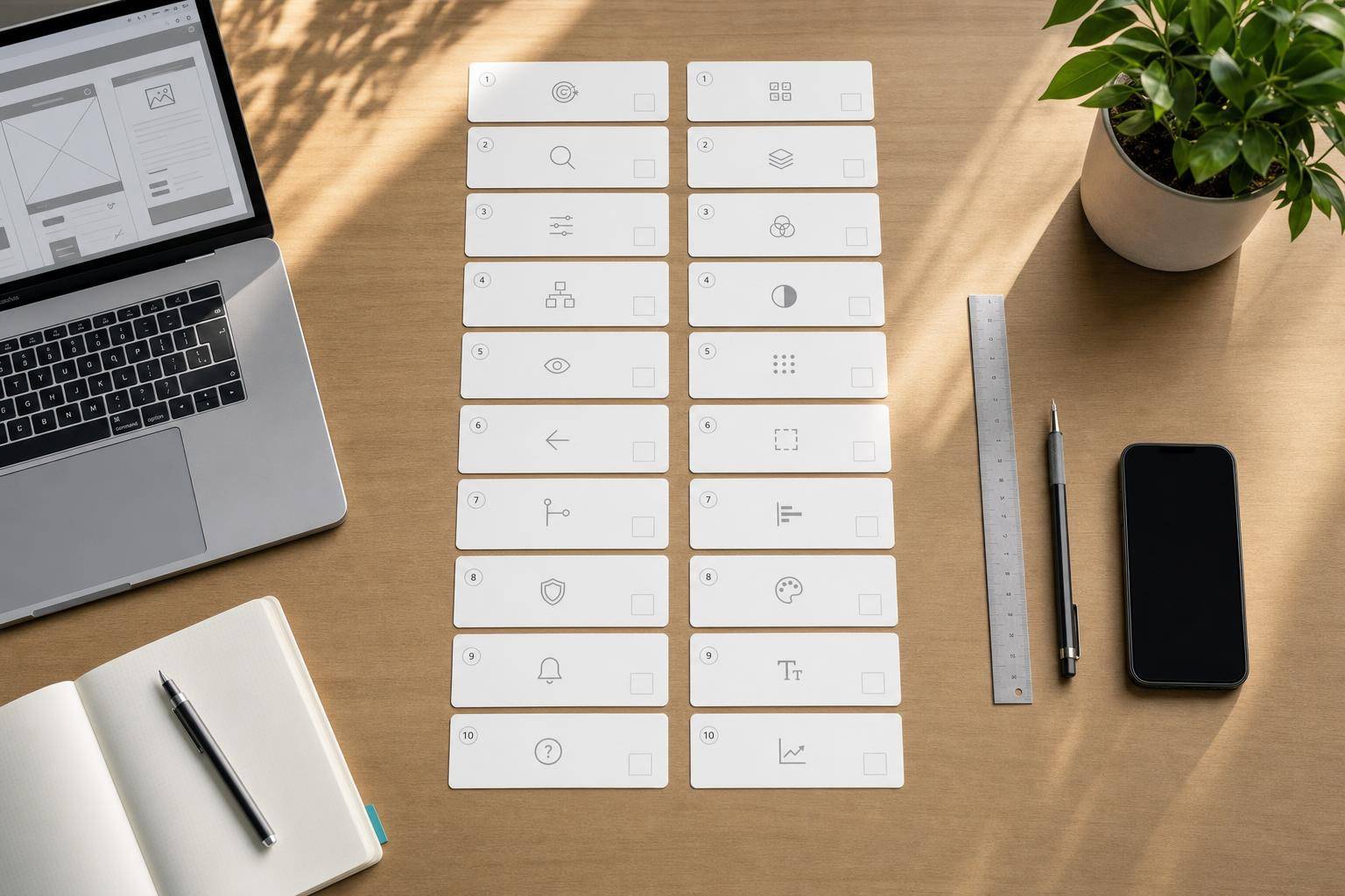
The 10 UX Heuristics: The Foundation of Usability Audit
The video relies on Nielsen's heuristics, presented as an inspection method to quickly identify usage issues on an existing app or website.
1. System State Visibility
The user should always understand what is happening.
Classic examples:
- loading indicator
- confirmation message after an action
- progress in a form
- active/inactive state of a button
If there is no indication that a page is loading or a step is in progress, the user doubts. This doubt creates friction, then abandonment.
Professional context: on a client portal, a banking space, or an e-gov interface, lack of feedback is not just an ergonomic detail; it can be perceived as a reliability issue.
2. System-World Realism Match
The interface should speak the users' language, not the technical team's.
The video gives the example of familiar icons like the trash can. The principle is simple: prefer known conventions to internal formulations.
To avoid:
- opaque business jargon
- technical system messages
- ambiguous labels
- artificial structures that do not match the user's mental model
For a broad and multilingual audience, such as in French-speaking Switzerland or an international context, this principle becomes even more strategic.
3. User Control and Freedom
The user should be able to go back, undo, correct.
The video mentions very telling scenarios:
- unintentional exit from a screen
- error during checkout
- need to modify an action before validation
A good interface does not trap. It anticipates that the user may hesitate, make mistakes, change their mind.
Remember: if an important flow does not offer a clear way back or cancellation option, it generates unnecessary anxiety.
4. Consistency and Standards
Elements should behave as expected.
This includes:
- icons
- navigation patterns
- action positions
- industry conventions
The video mentions the shopping cart as a typical example: no need to reinvent this symbol if all users already understand its meaning.
In business, consistency should be observed at two levels:
- internal: the same component always behaves the same way
- external: the interface respects common digital practices
5. Error Prevention
It is better to prevent errors than to correct them afterward.
Examples given in the video:
- "submit" button disabled until the form is complete
- clear messages when a field is invalid
- distinct visual states based on data validity
This is a principle often underestimated. In a complex tunnel, error prevention reduces:
- abandonments
- support requests
- distrust
- re-entering data
6. Recognition Over Recall
The user should not have to remember everything.
The video mentions suggestions in a search bar. The general idea is to show useful options at the right time, rather than requiring a memory effort.
To implement:
- auto-completion
- contextual suggestions
- history
- visible labels
- clear navigation cues
The lower the cognitive load, the smoother the experience appears.
7. Flexibility and Efficiency of Use
A good interface works for beginners as well as advanced users.
The video uses the example of keyboard shortcuts in expert tools. This is an excellent illustration: a mature interface often offers multiple levels of usage.
Examples:
- shortcuts
- custom preferences
- saved filters
- quick actions
- simplified paths for regular users
In a professional environment, this principle is particularly valuable for extranets, dashboards, and internal tools.
8. Aesthetic and Minimalist Design
Anything that does not help the user can become a distraction.
The video compares this principle to the simplicity of a page like Google's: few elements, little noise, a clear objective.
Minimalism does not mean "empty." It means:
- prioritizing information
- removing unnecessary decoration
- avoiding overload
- focusing attention
Many interfaces fail here not because they lack content, but because they display too many intentions at once.
9. Help Recognize, Diagnose, and Correct Errors
A useful error message explains:
- what is wrong
- why it is blocking
- how to correct it
The video implicitly contrasts vague technical messages with concrete formulations like: the password must have a minimum number of characters.
This is a major difference. A good message is not just informative; it is actionable.
10. Help and Documentation
Even a well-designed system sometimes needs assistance.
The video mentions:
- FAQs
- tooltips
- contextual help
The right approach is not to overload the interface with too much explanation, but to offer help when the question arises.
In complex journeys - registration, compliance, health, finance, administrative - this principle becomes critical.
The 10 Visual Design Principles: Making the Interface Readable and Credible
After usability, the video moves to the visual layer. Here again, the interest is practical: it aims to evaluate why a screen appears cluttered, unbalanced, or unprofessional.
1. Balance
Visual weight should be distributed stably.
This includes:
- spacing
- blocks
- volumes
- information density
An unbalanced screen strains the eye, even if the user cannot express it.
2. Alignment
Elements should convey a sense of order and connection.
Good alignment:
- enhances readability
- strengthens credibility
- clarifies relationships between elements
Poor alignment immediately creates an amateurish impression.
3. Repetition
Colors, buttons, icons, card styles, typography: patterns should repeat consistently.
The video reminds that the same type of button should follow the same logic across all screens. This repetition fosters familiarity.
It is also the basis of a serious design system.
4. Contrast
Contrast is used to distinguish, prioritize, and enhance readability.
It is not just about light versus dark. Contrast also helps to emphasize:
- the main action
- the importance of content
- the difference between states
- text readability on its background
In a Swiss or international context subject to high accessibility standards, insufficient contrast harms both the experience and inclusion.
5. Space
"Empty" space is not wasted. It structures understanding.
The video emphasizes this idea through airy interfaces: space helps isolate priorities and lighten reading.
Note: too little space suffocates the interface, but too much space can also give a sense of incompleteness or floatiness. Space should be intentional.
6. Shape
Shapes carry implicit meaning.
The video mentions rounded corner buttons. Without entering a stylistic dogma, one can remember this: shape influences the perception of comfort, modernity, and clarity.
Shapes also help distinguish:
- clickable areas
- information cards
- form fields
- statuses or categories
7. Direction
The gaze should be guided.
In Western interfaces, reading generally follows a left-right and top-bottom axis. Design should accompany this movement:
- block order
- visual trajectory
- arrows
- title hierarchy
- CTA placement
A good screen "reads itself."
8. Size and Hierarchy
Size indicates importance.
Headings, subheadings, labels, key values: if everything has the same weight, nothing stands out. The video emphasizes this principle with the example of large news headlines.
Visual hierarchy allows instant answers to three questions:
- what matters most?
- what explains?
- what is secondary?
9. Color
Color conveys both function and emotion.
The video recalls some common associations:
- red: alert, error, urgency
- green: success, validation
- yellow: attention
- blue: trust
However, an important nuance must be added: the meaning of colors also depends on cultural context, industry, and overall contrast. In UX, color should never be the sole bearer of meaning.
10. Components and Elements
The video concludes with the logic of components: buttons, inputs, icons, cards should be thought of as reusable building blocks.
This is a crucial point for organizations managing multiple pages, languages, or teams.
A component system brings:
- consistency
- time savings
- better maintainability
- more predictable experience
For a large company, an institution, or a multisite platform, this often makes the difference between a handmade interface and a mature platform.
What the Video Shows Very Well: UX/UI Audit is a Method, Not an Opinion
One of the most useful contributions of the course is the demonstration of an audit on an existing application. Even if the case presented remains educational, the logic is very accurate: we do not just say "I do not like this screen," we link each problem to a specific principle.
This transforms a subjective critique into actionable recommendations.
How to Audit an Interface in Practice
Here is the implicit method of the course, reformulated in a professional version.
Step 1: Choose a Real Path
Instead of evaluating "the application in general," choose a complete flow:
- home page
- list of products or services
- form
- result
- checkout
- customer area
A good audit focuses on a task.
Step 2: Analyze Screen by Screen
For each screen, note:
- understanding issues
- visual frictions
- inconsistencies
- missing elements
- error risks
Step 3: Link Each Problem to a Heuristic or Principle
Examples:
- lack of contrast → contrast principle
- vague label → real-world correspondence
- no way back → control and freedom
- visual overload → minimalist design
- missing progression → system state visibility
Step 4: Qualify Severity
The video mentions severity levels: low, moderate, high.
This is an excellent practice, as not all problems have the same impact.
You can judge severity based on three criteria:
- likely frequency
- task impact
- difficulty of workaround
Step 5: Formulate a Concrete Recommendation
A good audit does not stop at observation.
It suggests:
- a clearer label
- a better hierarchy
- clarification of CTA
- progress indicator
- contextual help
- clearer visual structure
Analysis of the Presented Case: Why Some Screens Fail
The video uses an example of an application related to scalp health. The case is interesting as it illustrates several common mistakes.