7 techniques to improve mobile conversions
7 techniques to improve mobile conversions
Do you want to increase your mobile conversions quickly? Here are the 7 key techniques to apply right now:
- Mobile-focused design: Adapted buttons (minimum 44 px), readable text (16 px or more), and simplified forms.
- Fast loading speed: Reduce image size, enable caching, and optimize code.
- Simple purchasing process: Integrate quick payments (TWINT, Apple Pay) and limit requested information.
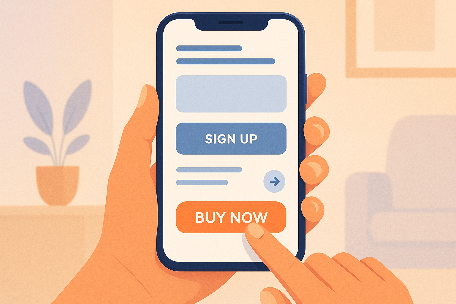
- Effective CTAs: Place them within thumb's reach, use contrasting colors and engaging text.
- Clear navigation: Visible hamburger menu, accessible search bar, and easy return to the homepage.
- Data analysis: Track behaviors with Google Analytics and test your optimizations.
- Local personalization: Adapt content based on language and Swiss user preferences.
Quick summary:
For the Swiss market, adhere to local formats (dates, currencies, etc.), offer multiple languages (fr-CH, de-CH, it-CH), and comply with laws (LPD). These actions, combined with the above techniques, maximize your results.
| Method | Impact on conversions | Implementation complexity |
|---|---|---|
| Very high | Average | |
| Loading speed | High | High |
| Simplified purchasing process | Very high | Average |
| Well-placed CTAs | Medium | Low |
| Simplified navigation | High | Average |
| Data analysis | Medium | High |
| Personalization | High | High |
Apply these tips in three steps: audit, quick adjustments (CTAs, navigation), and gradual optimizations. These structured actions will effectively improve your mobile conversions.
Common Mobile Conversion Issues
Constraints of Small Screens
Small screens (4 to 6.7 inches) require a clear and functional design. It is crucial to ensure optimal readability of texts and well-sized buttons for smooth navigation. With limited space, each element of the interface must be carefully prioritized to provide a pleasant user experience.
Multi-Device Compatibility
A high-performing site must adapt to various devices, operating systems, and browsers. In Switzerland, where multiple languages coexist, display must also adjust according to the chosen language. This adds an extra layer of complexity while demanding a consistent experience across all devices.
Mobile Users' Behavior
Mobile users seek precise information or wish to perform a specific action quickly. Their sessions are often short and focused. Additionally, frequent interruptions (notifications, calls) require user journeys that allow easy resumption of interrupted actions. A simplified and intuitive design is essential to build trust and encourage mobile conversions. These challenges underscore the importance of optimization techniques discussed in the following sections.
7 Methods to Increase Mobile Conversions
Priority Design for Mobile
Create your interfaces with mobile-first in mind, then adapt them to larger screens. Here are some essential points to keep in mind:
- Well-sized buttons: minimum 44 pixels for easy use.
- Readable text: font size of at least 16 pixels.
- Adequate spacing: avoid elements being too close together.
- Simplified forms: prioritize auto-completion to reduce efforts.
These adjustments make the user experience smoother on mobile.
Speeding up Loading Time
A fast site retains mobile users better. To improve speed:
- Compress images using formats like WebP.
- Enable browser caching.
- Reduce CSS and JavaScript code size.
- Use GZIP compression.
- Optimize font loading.
Simplifying the Purchase Process
Make purchasing faster and easier by:
- Offering social media login options.
- Enabling form auto-fill.
- Integrating quick payment options like TWINT or Apple Pay.
- Limiting requested information to the essentials.
Well-Placed and Attractive CTAs
Place your calls to action (CTAs) in easily accessible areas, like the thumb's comfort zone. To make them effective:
- Use contrasting colors to make them stand out.
- Write short and engaging labels.
- Ensure they are large enough to be easily clicked.
Simplified Navigation for Mobile
Clear and intuitive navigation is crucial:
- Include a clearly visible hamburger menu.
- Limit navigation levels to a maximum of two.
- Provide an accessible search bar.
- Add a simple way to return to the homepage.
User Data Analysis
Once adjustments are made, analyze behaviors to further optimize the mobile experience:
- Use tools like Google Analytics 4 to track user journeys.
- Identify problematic areas with heatmaps.
- Analyze abandonment rates at each step.
- Test different approaches with A/B tests.
Personalization for Users
Offer a tailored experience by:
- Adapting content based on location.
- Adjusting offers according to usage context.
- Segmenting users based on behaviors.
- Providing personalized recommendations.
Comparison of Methods
Here is an overview of the impact and complexity of each method:
| Method | Impact on Conversions | Implementation Complexity |
|---|---|---|
| Mobile-First Design | Very high | Average |
| Speed Optimization | High | High |
| Simplified Checkout Process | Very high | Average |
| Well-Placed CTAs | Medium | Low |
| Simplified Navigation | High | Average |
| Data Analysis | Medium | High |
| Personalization | High | High |
Your Mobile Site is KILLING Your Conversion Rate
sbb-itb-454261f
Swiss Market Requirements for Mobile
These local specificities complement optimization techniques by ensuring a perfect fit with the Swiss market.
Linguistic Options
In Switzerland, a naturally multilingual country, it is crucial that your mobile site meets local language preferences. Here are some essential points:
- Offer at least French, German, Italian, and English.
- Add a prominently visible language selector.
- Use geolocation to preselect the appropriate language.
- Enable automatic language detection via the browser.
For proper implementation, configure hreflang tags with appropriate regional variants (fr-CH, de-CH, it-CH, en-CH).
Swiss Format Standards
Adapt local formats to enhance user credibility and trust:
| Element | Swiss Format | Example |
|---|---|---|
| Currency (CHF) | With space | CHF 1'499.90 |
| Date | DD.MM.YYYY | 26.04.2025 |
| Numbers | Apostrophe as separator | 1'234'567.89 |
| Postal code | 4 digits | 1204 Geneva |
Swiss Legal Requirements
Comply with LPD to establish a trusted relationship with your users:
- Integrate a cookie banner compliant with LPD.
- Host Swiss user data on servers located in Switzerland.
- Clearly display terms and conditions of sale (CGV) and privacy policy.
- Include all mandatory legal information, such as company name and IDE number.
To meet these requirements and optimize your mobile conversions, explore the solutions offered by .
Comparative Table of Methods
Here is an analysis of the skills required and tools associated with each method:
| Method | Required Skills | Necessary Tools | Maintenance Frequency |
|---|---|---|---|
| Mobile-First Design | UI/UX designer, front-end developer | Design software, responsive frameworks | Every 3 months |
| Speed Optimization | Full-stack developer | Performance analysis tools, CDN | Monthly |
| Simplified Checkout Process | UX designer, back-end developer | Secure payment gateways | Every 6 months |
| Well-Placed CTAs | UI designer | A/B testing tools | Every 3 months |
| Simplified Mobile Navigation | UX designer | Prototyping software | Every 6 months |
| User Data Analysis | Digital analyst | Analysis tools, BI solutions | Weekly |
| User Targeting | Digital marketing specialist | CRM, personalization tools | Monthly |
These details help guide your choices based on available resources.
To maximize results with limited means, focus on mobile CTAs, simplified navigation, and mobile data analysis. These elements offer a quick and measurable impact.
Next Steps
To apply these mobile, follow this plan in three phases:
Phase 1: Evaluation and Analysis
Start with a detailed audit of your mobile site. Identify obstacles hindering your users and pinpoint key performance indicators (e.g., bounce rate or cart abandonment).
Phase 2: Priority Optimizations
Quickly make adjustments with immediate impact: improve your calls to action (CTAs) and simplify navigation. Install analysis tools to monitor performance. These initial changes serve as a foundation for more complex adjustments.
Phase 3: Progressive Implementation
Once the basics are in place, proceed with more advanced optimizations gradually:
- Integrate specific technical improvements
- Test each modification and analyze results to refine your approach
Concentrate your efforts on elements offering the best return, as indicated in the previous comparative table.
The goal is to clearly increase your mobile conversion rate through a structured and progressive method.
FAQs
How to evaluate the effectiveness of mobile optimizations on my site?
To assess if your mobile optimizations are effective, focus on two key aspects: user experience and technical performance.
You can use tools like A/B tests, user data analysis, or performance audits to measure indicators such as conversion rate, page loading time, or navigation smoothness.
The agency , based in Geneva, offers specialized services in and CRO strategy to help you maximize the results of your digital efforts. By combining innovation and technical expertise, you can obtain precise analyses and solutions tailored to your needs.
What tools to use to analyze user behavior on mobile?
The article focuses on practical techniques to improve mobile conversions but does not mention specific tools for analyzing user behavior. If you want to optimize your mobile site or app, it is essential to choose solutions tailored to your needs, such as UX analysis tools or performance tracking platforms. For personalized support and innovative solutions, you can turn to experts in digital services.
How to optimize a mobile site to meet linguistic and cultural preferences in Switzerland?
To optimize a mobile site based on linguistic and cultural preferences in Switzerland, it is important to consider the linguistic diversity (French, German, Italian, and Romansh) and the cultural specificities of each region. This includes:
- Offering localized content with precise translations adapted to the cultural context of each language.
- Displaying local formats for dates (e.g., 31.12.2023), currencies (CHF), and numbers (1'000.50).
- Designing an intuitive user experience, taking into account navigation habits specific to each region.
A well-thought-out approach ensures a better user experience and enhances engagement with Swiss visitors.